


I'm using text as links to chapters from the menu. Although the text looks crisp and sharp in the preview, in the simulation and compiled dvd it becomes quite blurred. I'm using PAL, and white text over coloured background, but even if I use black text it's the same. What's causing this ? I'm using the same text font and size as titles in my movies which remain crisp and clear after the DVD has been compiled... Thanks.
+ Reply to Thread
Results 1 to 13 of 13
-
-
I have the same issue if I create the menu background (with text) outside of DVDLab. I'm using v1 Pro.
If the text "Play Movie" is part of the menu background image, how do you get it to highlight if user moves cursor over it ? -
If you use photoshop you can do it two ways
1. Create a psd file that has the text as part of the background layer, and a duplicate on a separate layer. Import this into DLP, and the separate layer becomes a button you can link to.
2. Create a single layered menu file (or video, if you want a motion menu) then use lines or dingbats to indicate which menu choice is current.
There are documented issues with some of the anti-aliasing in version 1.x. These have long since been resolved, however text handling is still pretty simplistic, which is why I prefer to use photoshop.Read my blog here.
-
guns1inger, you wrote also on other thread the the issue is resolved. It's not, imo - I have 2.34 version installed. The only solution is to experiment with colour setting (link/highlight) but even then it's not as sharp clear as rendered by TDA or Maestro.
Another issue: DLP doesn't handle correctly PSD text layers. If there is a style applied on the text layer, and even the text is rasterized, the style is gone in DLP, unless imported as merged / single object. -
Very few programs, except for adobe software, import PSD files with layer styles intact. Layers should only be used in DLP as sub-pictures, and sub-pictures are restricted to a maximum of 4 colours, so layer styles don't work anyway.
Post some examples of what you think is a problem.Read my blog here.
-
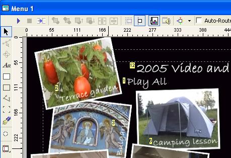
Please see below - the first is crisp and clear when I'm setting up the links, but when I simulate (the second pic) the sharpness goes...
-
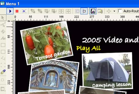
...and as seen in simulation/final DVD
-
When I run a simulation in DLP the crispness of the test used for links or otherwise does not change. I will post pics later is necessary, but I cannot replicate what you are seeing.
Read my blog here.
-
Your example looks strange as usually it's not as bad
 Anyway, a good general rule for selecting a colour: don't use pure RGB, i.e. 255,255,255 but keep the values below 236. Although your computer monitor displays them correctly but a TV won't - they may cause flickering.
-
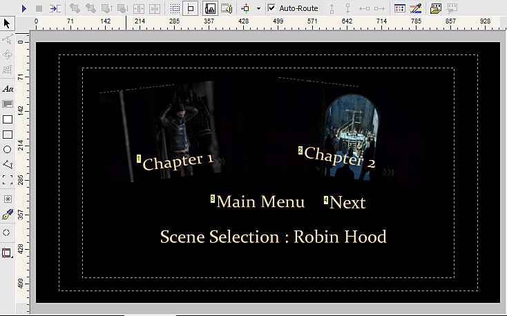
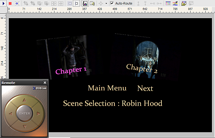
As promised, here are a design mode and simulation mode screen grab from DLP. As you can see, there is no discernible difference in text quality between the two states. This menu was created entirely inside DLP for the purpose of this test. Normally I would use photoshop.
First : Design Mode
Next : Simulation Mode
I strongly suggest you move up to version 2 of DLP, or design your still menus outside DLP and import them. It can only be a version 1.x problem. Have you upgraded to the last version 1 patch - 1.6, I believe ?Read my blog here.
-
After some playing around I noticed that I'd set the text I used on the menu to bold and when previewed DLP seems to automatically add Bold to the text, so bold on bold was blurring the text. If I take bold off my text and let DLP go ahead and add it's bold then the blurring is more acceptable...

 Quote
Quote
Similar Threads
-
dvd lab pro - text labels as buttons - problem
By pike8 in forum Authoring (DVD)Replies: 2Last Post: 21st Apr 2012, 07:03 -
DVD-Lab Pro: Subtitles change text
By TheLaserdisc in forum Authoring (DVD)Replies: 8Last Post: 18th Aug 2010, 13:23 -
Blurred Text on DVD Menu
By boofer in forum Authoring (DVD)Replies: 3Last Post: 10th Jan 2009, 18:45 -
editing text in menu in an already made dvd
By gameroftheuk in forum Newbie / General discussionsReplies: 2Last Post: 18th Aug 2008, 22:32 -
Jumping Text on Motion Menu in DVD Lab Pro 2
By christopheramos in forum Authoring (DVD)Replies: 0Last Post: 21st May 2008, 08:32