


encore and ps, for my website (www.thecomatorium.com)

+ Reply to Thread
Results 1 to 13 of 13
-
-
Very nice looking.
-
Great.
tgpo, my real dad, told me to make a maximum of 5,806 posts on vcdhelp.com in one lifetime. So I have. -
Very professional!!
SLICK RICK Originally Posted by lordsmurf
 -
I'd be grateful to know how you took the picture(s) and feathered the edge so it effectively 'merged' with the solid black, kinda fades in, doesn't it?
Trying to do a similar thing with my family DVD backgrounds, but it's looking a pig.
Willtgpo, my real dad, told me to make a maximum of 5,806 posts on vcdhelp.com in one lifetime. So I have. -
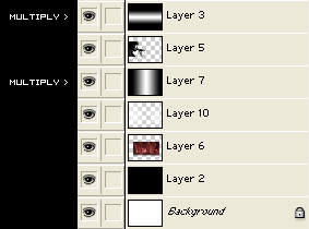
Just Multiply a gradient layer that goes both horizontal and verticalOriginally Posted by Will Hay
-
If you don't mind me asking, what fonts did you use?
-
Well its awfully black, but if its dark music than I suppose its apprioriate. I personally don't like the chapter selection menu. I assume that creature is the band's logo? It seems hard to distinguish what the underlying images are. I think a traditional approach may be more effective. I'd at least make them bigger so you see more of the video underneath (I assume its a motion menu.)
I also think you could improve the back of your DVD cover. The picture of the singer looks good but you used it on the front and on your main menu. You really need to find a different image for the back because its just too repetitive and I'd also add some color. Its just too plain with all that black. Increase the font size of the title on the spine. Not the date or the Live @, just the title. You've got some room to spare and I don't think it would be very legible when sitting on the shelf as is.
Have you actually authored this yet? Some of your text, like your Chapter selection and Bonus Material, look too close to the right side. Remember that 12-16 pixels will be cut off when played on the tv. It looks like you are cutting it close.
Overall it looks very good in my opinion. I'd give it a 4. -
Video Restorer

- Jun 2003
- dFAQ.us/lordsmurf


The fonts are too hard to read. Hurts my eyes even.
Not sure how well small text will fair on tv screen.Want my help? Ask here! (not via PM!)
FAQs: Best Blank Discs • Best TBCs • Best VCRs for capture • Restore VHS -
Member
- Sep 2003
- United States
-
true
-
Originally Posted by theory
Thanks, I'll have a play.
Good luck with the release
W.tgpo, my real dad, told me to make a maximum of 5,806 posts on vcdhelp.com in one lifetime. So I have. -
Ha, everything is exactly how I want it.
The text fits perfectly on the screen, and it's all legible. -
Naa, they are easy to figure out when in motion.Originally Posted by adam

 Quote
QuoteSimilar Threads
-
My very 1st HDV burn to dvd/need advice please
By Canon GL-2 Guy in forum Newbie / General discussionsReplies: 13Last Post: 16th Jul 2010, 01:51 -
Panasonic DMR-E55-E55S or E55K?1st DVD recorder/1st time posting
By ToeTagged in forum DVD & Blu-ray RecordersReplies: 7Last Post: 19th Jan 2008, 15:33 -
DVD Decrypter stops after 1st cell
By MeInNYC in forum DVD RippingReplies: 2Last Post: 25th Dec 2007, 12:59 -
my 1st dvd recorder
By M-girl in forum DVD & Blu-ray RecordersReplies: 20Last Post: 11th May 2007, 01:15 -
1st two DVD-DL recordings failed
By DSSTBUSTER in forum DVD RippingReplies: 28Last Post: 9th May 2007, 02:23