


Is there a better choice of what to use for still images on a DVD? The program exported images in 72DPI PNG and 96 DPI BMP.. , both 1-bit (black and white, and yes I know the black and white have to be adjusted to NTSC colors) but as far as the image formats themselves, is there any difference, is one better than the other appearancewise for the DVD? To my eye, they look identical...
+ Reply to Thread
Results 1 to 30 of 30
-
-
As far as I know, PNG is a "bitmap" image, just one that's designed to be interchangable among different platforms with minimal issue (Portable Network Graphic). It's more of a replacement to the GIF format, as it (PNG) can also handle transparencies, and it may be a little smaller (file size) for the same bitmap image, if that bitmap image is in the .bmp format. If that made sense.
 Also it's free; GIF is a trademark (from Compuserve?) so they (Compuserve?) theoretically are supposed to get a cut from any program that saves GIF files, but I have no idea if that's enforced or not. Anybody know?
EDIT: That's a long way of saying, there's no difference, use whichever one you've got!
-
gotcha; thanks!
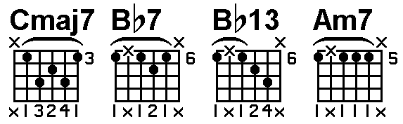
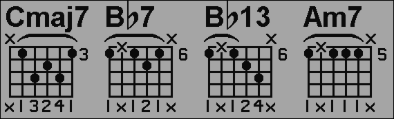
Another question- is there anything I can do to the image PRIOR to importing it into my NLE to reduce flicker, crawling edges, etc? It's music notation and guitar chord grids (black on white). I already know I have to apply the color filter to it for NTSC safe colors and a slight gaussian blur,, anything else? I've noticed though that the gaussian blur makes it look good on a TV, but it looks blurry on a computer monitor. Is there a way to satisfy both? I've attached one of the images.. The goal is to have this look good on both the computer monitor and Television too. Also, it will be shrunk and positioned below the main subject area on the DVD.
-
Both BMP and PNG support different bit depths and compression algorithms.
Common bit depths for both are 1 (2 color), 4 (16 color), 8 (256 color), 24 (16M colors, "truecolor"), and 32 (24 bit with 8 bit alpha channel).
BMP is usually uncompressed but it can be losslessly compressed with run length encoding (a simple compression algorithm). PNG is usually losslessly compressed with a much more powerful algorithm. At the same bit depth the two formats will deliver the same picture quality. The PNG file will normally be much smaller because the the better compression. -
thanks for clarifying that up for me, no wonder they look the same and yes, the PNG is MUCH smaller... any advice on my second post?
-
If you are talking about the same video (ie DVD), not really.Originally Posted by sdsumike619
Some things you can try:
1) If you can, blur only on the vertical axis. It's the sharp horizontal edges that cause flicker on TV.
2) Use less contrast. More contrast means more flicker on TV.
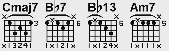
3) Instead of exporting 1 bit (2 color) from the software that's creating the chord patterns, export as 8 bit grayscale or 24 bit truecolor with antialiasing. Edges will look a little fuzzier on the computer (and flicker less on TV) but the rounded characters will look smoother on both. If your software doesn't support antialiasing, render at a much larger size (4x or more), again 8 bit grayscale or 24 bit truecolor, then blur and shrink the images:
The top line is the text rendered unantialiased with 1 bit color. The second line is the same text antialiased with 1 bit color but 6 times larger. The lowest line is the 6x text shrunken to the same size as the first with a Lanczos3 filter (about the equivalent of a small blur followed by a bicubic resize). -
How does this look? very slight blur, adjusted the levels to be 16 and 235 for video..
what I do is drop it on the timeline, then use pan/crop to size it down to fit into the frame, looks decent on both the TV and Computer monitor, I guess. The program I'm exporting the graphics from only has two options, high and low res files.. The low resolution ones look horrible and can't even be used. I'm using paint shop pro - Photoshop is supposedly good, but simple things I take for granted in PSP don't even exist in photoshop, as far as I can tell.. when I make a selection and go to paste, the only options in photoshop are paste and paste into.. In PSP, I can paste as new image which helps me make these images fast..Anyhoo, aside from that, I can increase the color depth in PSP without a problem because that's what I had to do to fix the black and white levels for video.. I'm not sure how to "antialias" the image, might have to look that one up, I thought that only applied to text but apparently not..
-
Why 1-bit ? On a TV display they will be much easier on the eye if properly anti-aliased. I would be doing them in 24 bit, anti-aliased.
Read my blog here.
-
because it's just a cheesy music notation software program without a lot of options, it just exports it the way it does. If I increase the color depth to 24 bit, does that automatically antialias it?
-
If you increase it in the program, it might. After the fact, no. However a slight blur will help.
Read my blog here.
-
Another thing you can try, is to leave the image as is and reduce the opacity to about 70-80%. That should help with flicker and you won't need to blur the image. You'll have to test it out to see what works best in your case.
I stand up next a mountain and chop it down with the ledge of my hand........ I'm a Voodoo child.... Jimi Hendrix, -
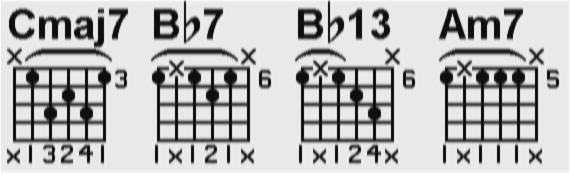
That's not enough blur, especially if you will be shrinking it to fit within the video frame.
Here's a trick you can use to get different amounts of blur on the two axis using a regular gaussian blur filter:
1) Resize the image making it 4 times wider, but keeping the same height.
2) Apply gaussian blur.
3) Resize image back to original size.
If 4x isn't enough try 8x, etc.
Here's your image blurred using this technique (at 8x, gaussian blur with radius 1.3):
-
The gif patent ran out a few years ago.Originally Posted by ozymango
-
The last (?) of the GIF patents is set to expire in a few days:Originally Posted by thecoalman
http://www.gnu.org/philosophy/gif.html#venuenote -
Try using a textured background A) it will look better and B) it will break up some of the lines. One odf the problems you have is the lines are so small that anti-aliasing is going to make them disappear.... So what I did. Added the textured background obvioulsy, applied a shadow with 0 transparency and a 2 px soft edge. Split the shadow from the object and discarded the object. This has the affect of anti-aliasing but more importantly it's exapnding the lines a few px.

-
You've also reduced the contrast by a huge amount.Originally Posted by thecoalman
-
Joint Photographic Experts Group(JPEG)
Good:
Photos
Game and background screenshots
Movie stills
Desktop backgrounds
Adjustable compression
Small file size
Wide software support
Wide browser support
Bad:
Line art and text
Comic-style drawings
Anywhere where fine lines or sharp color contrast is needed
Lossy when editing
Portable Network Graphics(PNG)
Good:
Text, line art, comic-style drawings
Combining text and photos
Screenshots
When accurate reproduction (lossless) is required (24 bit)
When alpha channel support is required
As a general replacement for anything that is a non-animated GIF
Supports transparancies
Wide browser support(24 bit)
Wide software support
Bad:
Disappointing browser support for 32 bit PNGs from Microsoft and others
Graphics Interchange Format(GIF)
Good:
Text, line art, comic-style drawings, icons,general web graphics
Where animations are required
Wide browser support
Wide software support
Small file size
Bad:
Photos
Large file sizes compared to PNG for the same quality
Often limited to 256 colors (8 bit)
Screenshots
Windows Bitmap(BMP)*
Good:
Wide software support
Combining text and photos
Lossless when editing
Desktop backgrounds
Screenshots
Bad:
Large file size
Doesn't support transparancies
Lossy when converting to other formats
Tagged Image File(TIF)*
Good:
Text and documents
Lossless when editing
Small file size
Bad:
Dissappointing browser support
Dissappointing software support
Screenshots
Targa(TGA)*
Good:
Similar to PNG(supports 24 and 32 bit)
Animation
Bad:
Disappointing browser support
Disappointing software support
Large file size(uncompressed)
*Not recommended -
I like the texture idea actually; didn't think of that, but how can I change the background to a texture? I tried to do a fill with varying tolerances to change the 255 white to 235 ntsc white but it didn't fill in the closed off grids of the chords.. If I try and do a fill with a texture the same thing will happen.. Is there a way to change that background all in one swoop or do I have to sit there and fill in each little grid?
Also, jagabo, you don't think that one you made is too blurry for the computer monitor? -
You could use a lighter texture or even use a different color for the shadow. The point being anything, even a slight variation, is better than a solid background.Originally Posted by jagabo
I just used the magic wand to select the text and black areas, converted it to an object. Placed it in a new image with the texture already applied. I don't have PS so I can't give you any specific directions.I like the texture idea actually; didn't think of that, but how can I change the background to a texture? -
Depends on the content, screenshots of say webpages where detailed photographic images are not involved gif is superior in quality and compression.Originally Posted by MOVIEGEEK
<searches for scratching his head emoticon> Tif is a lossless format like BMP but with compression.Tagged Image File(TIF)
Not recommended(outdated) -
Probably. But I was assuming (seeing your other posts) you were shrinking the image down to about half that size on the DVD. In any case I meant it as an example of how the technique works.Originally Posted by sdsumike619
Do it the other way around. Start with your two color notation image. Copy it to the copy/paste buffer. Paste it as on object on an image with the texture. Change the newly pasted object properties to make white transparent.Originally Posted by sdsumike619
By the way, you probably don't have to adjust the contrast of your b/w image to compensate for the IRE requirements of MPEG/DVD. Most MPEG encoders will automatically adjust an RGB source meet the 16-235 requirement for video (reduce the contrast). -
This is 70% opacity when overlayed on black (like black video). I think it would greatly reduce flicker because of less contrast. You'll have to try it out for yourself to see if it works.
 I stand up next a mountain and chop it down with the ledge of my hand........ I'm a Voodoo child.... Jimi Hendrix,
 -
Dipstick, yeah I agree but it's just too dark and blah looking.. I'm going to try the texture idea and see what happens, I might go less than 235 for the white, but not way way dark, kind of takes the life out of the image like a cloudy day
Jagabo, I'll try what you said about getting the texture to show through.. stay tuned =)
-
anyone know how to get to textures in photoshop?
-
I can't figure out how to make any kind of texture appear behind the music notation for the life of me..I figured out how to make the white transparent, but then when I go to do the texture thing, it says it has to convert to some other color depth, and then I lose the transparency.. Man I've spent the whole day on this and no progress.
-
Try converting your b/w chord diagram images to truecolor after opening it. Then copy/paste into an image with a texture pattern.
-
truecolor; how many bit is that, 8, 16, 24, 32 ?
-
24 or 32. Just convert the the same color depth as the texture image.Originally Posted by sdsumike619
-
I can't make the texture thing happen, it doesn't work for me, plus my computer basically comes to a standstill when trying to do stuff with this giganto file
I'm thinking about scrapping the whole idea about music on the screen.. I can't have it look good on a TV and like it's intentionally meant to look like one of those stupid blurry t-shirts for those viewing it on the computer.. -
I'm at it again, ideas for a good texture/pattern to use to put behind these things so they still show up well?
 Quote
QuoteSimilar Threads
-
VirtualDub commandline - AVS to BMP/PNG/JPG
By wiseant in forum Video ConversionReplies: 0Last Post: 10th Mar 2012, 18:01 -
Avisynth: PNG sequences on MP4 video
By KBII in forum SubtitleReplies: 0Last Post: 7th Feb 2012, 05:08 -
Help with lossless ffmpeg command [video => png => back to video]
By vidgem in forum EditingReplies: 12Last Post: 15th Nov 2011, 11:30 -
YUYV to TIFF or PNG, or better yet, PNG to YUYV
By ekztal in forum EditingReplies: 18Last Post: 29th Dec 2009, 23:35 -
Making an avi from jpg, bmp or png files
By cabs46 in forum Newbie / General discussionsReplies: 3Last Post: 14th Jan 2009, 07:14