


Hi guys,
I designed two logos for our fictional crop protection company we have put together for one of my courses. We specialise in biological pesticide products. Which logo do you like better?
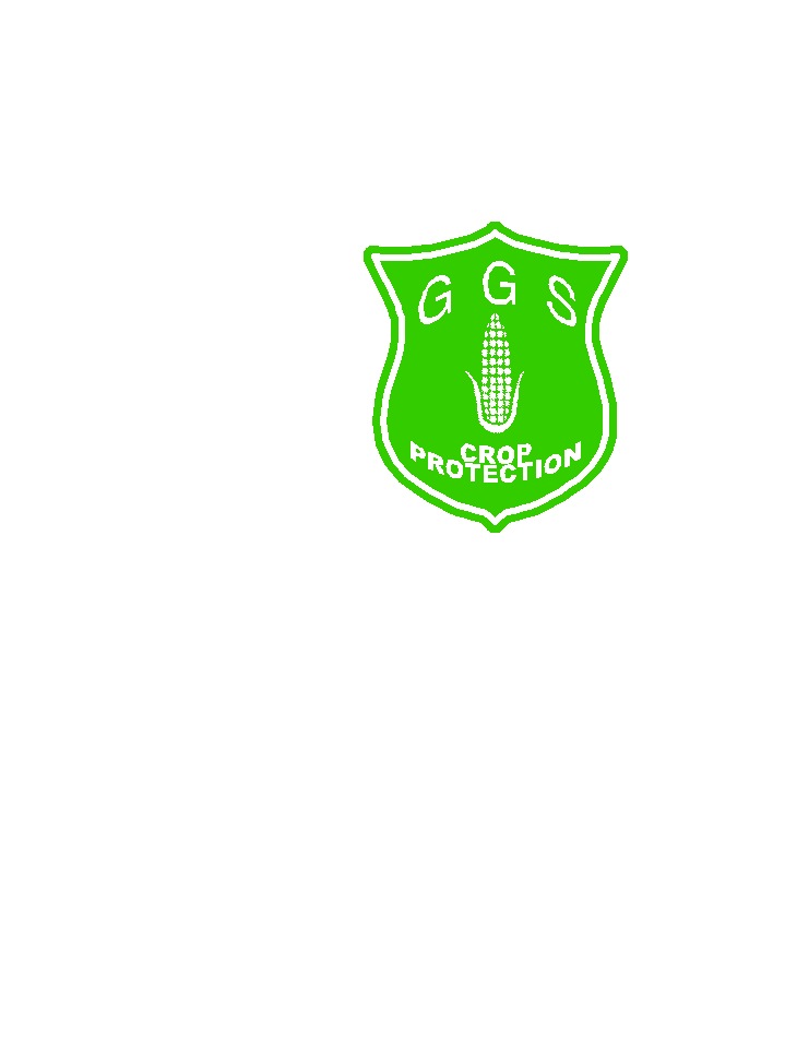
Logo 1:
Logo 2:
Any input would be greatly appreciated!
Thanks,
Cobra
+ Reply to Thread
Results 1 to 22 of 22
-
-
Well i prefer Logo 1 from purely looks but logo 2 is more related to what the company is about... but a bit bland
Maybe the by line for Logo 1 could be "out of this world crop protection" -
#1 - because #2 looks like the protection is a greenhouse ...
which maybe misleading ...."Each problem that I solved became a rule which served afterwards to solve other problems." - Rene Descartes (1596-1650) -
the fonts used in #2 also are not good ...
also the letters are spaced to close in #1"Each problem that I solved became a rule which served afterwards to solve other problems." - Rene Descartes (1596-1650) -
Thanks for the responses, guys - remember to press the poll buttons!

promark - I'll suggest an alteration to the slogan to the group tomorrow. Thanks for your idea!
BJ_M - True, it is quite a complex image to use in a logo - they're normally simpler.
(EDIT - the font is a bit crushed. It's a trial logo - I'll iron it out once I know which to use!) -
I ain't no expert, but that has never stopped me before. Just an opinion or observation, but I thought that "logos" were like a stylized image or lettering that are used for advertising. I would think that using a photo is too much. I mean that your logo should be like a sillotte (SP) or single color. Very stylized letters like McDonalds "golden archs" or like Hewlett Packards "HP" come to mind when I think of logos.
What do the letters stand for?
 IS IT SUPPOSED TO SMOKE LIKE THAT?
 -
Zapper again I am no expert but i do agree with your definition of a Logo this is more a ad banner, perhaps Cobra could take the GGS and stylise it and use that as a logo in conjunction with the banner
Just an idea -
On reflection, you're both spot-on. I was imagining how it would look on the top of a letter or something. Hmmm... Maybe a rethink tomorrow.
However, more opinions on those two would be gratefully recieved.
Thanks ZAPPER and promark! -
I voted for #1 (simply because it's smalller), but both logos are quite good.
It's the slogan that's not so hot...."To steal ideas from one person is plagiarism; to steal from many is research." - Steven Wright
"Megalomaniacal, and harder than the rest!" -
It seemed good at the time... That was after two hours of mind-numbing lecture!
-
#1 - #2 is too boxy to be catchy.
-
Serene Savage

- Mar 2004
- Controlled Chaos


I like the first one. The picture conveys to me the words technology and environment. So it's like saying you've got a cutting edge product thats safe to use.
I don't care for the second one. The words it conveys is "farmer next door". Kind of seems like you're reusing old, tried and true methods from the past.
Just my 2 cents. -
That's how I feel about it. Personally I prefer the first logo, by far.
-
#2. It conveys 'earth friendly'. The first one makes me think of chemicals that are harmful to the environment. The second one makes me say "Hey. These guys care about the planet."
-
the first one for effect alone
I'm seeing the same thing with the sun but this time over a field of crops instead exactly the same style as the first one 8) -
Yes, they should be. Simple and easily identifiable even if a single color. I like the looks of number 1, that can be converted to something more logo like.Originally Posted by ZAPPER
-
 IS IT SUPPOSED TO SMOKE LIKE THAT?
 -
ERRRR! It wasn't supposed to be that big!
IS IT SUPPOSED TO SMOKE LIKE THAT? -
I would have to go with the first one. I'm too sure I really like the "A Fresh Take On Crop Protection" tagline. It's not very exciting (of course, neither is crop protection, I imagine).
-
how about a circle of fully armed swat team members standing around a single stalk of corn ?
"Each problem that I solved became a rule which served afterwards to solve other problems." - Rene Descartes (1596-1650) -
That or a fat rent-a-cop armed with his pen. :POriginally Posted by BJ_M
-
Video Restorer

- Jun 2003
- dFAQ.us/lordsmurf
-
A logo isn't really a photo.
The fonts don't work for you.Want my help? Ask here! (not via PM!)
FAQs: Best Blank Discs • Best TBCs • Best VCRs for capture • Restore VHS


 Quote
Quote
Similar Threads
-
Homeplugs Advice needed
By iCaptainChaos in forum Newbie / General discussionsReplies: 3Last Post: 13th Apr 2012, 08:35 -
Last Minute TV Advice Needed
By AuroEdge in forum Off topicReplies: 0Last Post: 13th Feb 2010, 19:47 -
New Case Needed....Advice?
By ron spencer in forum ComputerReplies: 4Last Post: 2nd Feb 2009, 18:44 -
iphone advice needed
By rhegedus in forum Off topicReplies: 6Last Post: 30th Aug 2008, 02:38 -
Memory upgrade needed for TMPGENC DVD Author 3, advice needed
By Caned_and_Able in forum ComputerReplies: 8Last Post: 31st Jul 2007, 19:30