


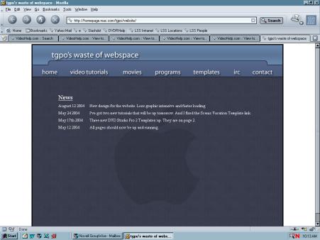
Well I've finally got a design I like. It's simple and quick to load. Please let me know how it looks on PCs with various browsers. Let me know if anything is out of place or strange looking.
http://homepage.mac.com/tgpo/website/
+ Reply to Thread
Results 1 to 26 of 26
-
-
Please note, not all pages are up as of yet.
-
Everything looks good on Mozilla Firefox 0.9.3.
-
Looks good here. Just seems a bit plain, but when you're using a MAC there aren't very many practical applications available.
 Just picking on ya. Looks good.

-
looks good on aol 9.0

-
Member

- Apr 2002
- Adrift among the STUPID


You admit to using AOL?Originally Posted by gooberguy
-
Originally Posted by Doramius
 "Terminated!" :firing:
 -
Member
- Apr 2002
- Adrift among the STUPID
-
Can't get there from here right now. Sorry.
-
I like it. Loads quick and easy to navigate with IE 6.
-
To be honest, that's what I was going forOriginally Posted by Doramius
-
Video Restorer

- Jun 2003
- dFAQ.us/lordsmurf
-
Fonts are hard to read. Times is no good on PC screen (or MAC!). Try VERDANA or ARIAL or HELVETICA instead. A sans serif.
Design nice a simple. Does its job.Want my help? Ask here! (not via PM!)
FAQs: Best Blank Discs • Best TBCs • Best VCRs for capture • Restore VHS -
Simple text is all you need. I like plain and simple. A lot of people try to be all complicated and flashy that I think makes the site look like every other site. A plain site really stands out. What I'm getting sick of is people who must do a whole site in flash, think thats the only way to go, and think thats great design. So I have to wait three minutes loading different pages just to get your e-mail address or contact info.Originally Posted by DoramiusHis name was MackemX
What kind of a man are you? The guy is unconscious in a coma and you don't have the guts to kiss his girlfriend? -
One more thing. I kind of went on a little rant that I forgot what I was going to say. The top looks a little off. It looks almost like the menu is supposed to go into that little bulgy area. And the site logo looks a little too low in the section.
His name was MackemX
What kind of a man are you? The guy is unconscious in a coma and you don't have the guts to kiss his girlfriend? -
Master of Time & Space

- Feb 2004
- Denver, CO United States
-
tgpo,
Nice and clean. I'd go with Arial too, though. Crisper-looking.
If you want to see how not to design a website, go to Rayban's site, and get ready to wait a long time for each page. They have that site so rigged with razzle-dazzle it's nauseating.
Conquest -
-
two things -
- first page comes up with the blue graphic centered - all others come up with it justified top left.
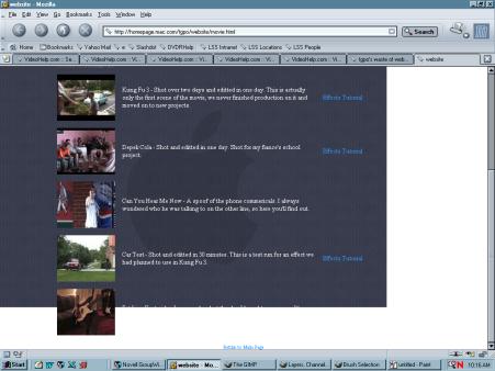
- on the movies page, even if I scroll down all the way, I can't read the text or click any links for the last movie listed - it's white text against a white border.
this is with Mozilla 1.6 / Win98 / 1024x768.- housepig
----------------
Housepig Records
out now:
Various Artists "Six Doors"
Unicorn "Playing With Light" -
The logo being that low was on purpose. I didn't want the logo to be a huge flash the engulf the whole page, I want it to appear to be resting just above the line below it.Originally Posted by Conquest10
As for the menu the little curvy area is only there to give the menu a small bit of non-boringness. It reminds me of a file folder and the top tab. You're probably right about the menu being in there, but that's another one of my website hates....menus that are too squished together. Thanks for the excellent feedback! -
What blue graphic? The apple in the background?Originally Posted by housepig
Why is there a border there? Can you post a screenshot for me?- on the movies page, even if I scroll down all the way, I can't read the text or click any links for the last movie listed - it's white text against a white border.
Thanks for the feedback! -
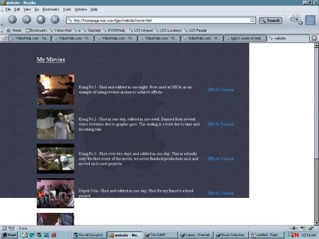
movie page scrolled all the way:
 - housepig
----------------
Housepig Records
out now:
Various Artists "Six Doors"
Unicorn "Playing With Light" -
I'm not saying it has to be blinding with adverts and flashing icons everywhere. Just knowing TGPO, I expected a little character out of it.
Think of a website like bread. I was thinking of something with light butter and a pinch of garlic on it, not a whole Ruben sandwhich. I just thought it fell along the lines of Dry Toast, graphic wise. As far as loading and ease to move through, it's 100% good in my book. -
Housepig: It doesn't seem to be taking the target tag for the links. All the pages should be loading in the iframe, not on their own....weird.
So when you click the links they open in a new window? -
well, I always use "open in new tab" in Mozilla, I hardly ever just click links.Originally Posted by tgpo- housepig
----------------
Housepig Records
out now:
Various Artists "Six Doors"
Unicorn "Playing With Light" -
Oh s***! We got quick reply on here! Sorry.
His name was MackemX
What kind of a man are you? The guy is unconscious in a coma and you don't have the guts to kiss his girlfriend? -
Looks Great! Got one problem when using Mozilla FireFox 1.9, though...
I can't see any of the pornography. You may want to check and make sure you fix that.
Other than that -- excellent. -
that'll be Kung Fu 5, the NC-17 version.Originally Posted by Ripper2860- housepig
----------------
Housepig Records
out now:
Various Artists "Six Doors"
Unicorn "Playing With Light" -
Will that be released on video soon? I need to get my order in.Originally Posted by housepig

 Quote
QuoteSimilar Threads
-
This website
By Will Hay in forum Off topicReplies: 24Last Post: 17th May 2013, 18:11 -
ISP problem - some website pages load, other website pages don't
By PartingShot in forum ComputerReplies: 15Last Post: 7th Sep 2012, 00:42 -
vod website
By bobmane in forum Video Streaming DownloadingReplies: 1Last Post: 7th Feb 2012, 12:59 -
vod website
By bobmane in forum Video Streaming DownloadingReplies: 0Last Post: 7th Feb 2012, 06:52 -
RipDifferent Website
By Eragon in forum MacReplies: 2Last Post: 10th Jan 2008, 09:29