


This guide is part of a bigger guide Im doing on authoring in general with DVD Maestro. This section is completely on subtitles and thus I think it deserved to be a guide on its own. I will be formatting it as I get time, and adding screen shots when I get the chance. For now I apologize if it is hard to navigate.
Subtitles are probably the only part of DVD authoring that has given me this much trouble.
The trouble with subtitles is that getting them the right length, font size, and font type can be a huge pain in the a$$, so with all the help I received and knowledge I learned making this guide I have decided to share.
Some of the information may be incorrect so I ask that you please inform me and I will correct it. On with the guide!
Software used:
SubtitleWorkShop
MaestroSBT
A decent Authoring program that accepts Image Subtitles
Maestro, Scenarist etc
If your using DVDLab, or DVDLab pro 1.53 go no further, the image subtitle support is broken as far as I have found and will only work if your willing to map the subs yourself (which when you have 1000+ is not worth it).
Why does this guide exist?
There are two two issues with subtitles:
1. Nice looking screen fonts cost too much money
2. No program addresses subtitle length properly
So as far as #1 is concerned your best bet is to either shell out the cash for a nice font (not worth it IMO), or use what ever you can for free.
So this guide will show you how to make the best possible looking subtitles.
So onto addressing issue #2.
Subtitles come in time frames.
For example
Sub# Show Hide Text
001 00:15:28,640 00:15:34,730 I am a subtitle
So basically this is Subtitle 1 that starts at 15 minutes, 28 seconds, and 640 milliseconds, and hides at 15 minutes, 34 seconds, 730 milliseconds.
And what will show is “I am a subtitle”.
So what’s the problem?
What if your line was “I am a subtitle, and I’m going to be extremely long”?
This line is too long, and most authoring applications won’t do the word wrapping for you, so you probably won’t see your entire subtitle on the screen.
What’s the commonly offered solution? Use a Subtitle program like SubtitleWorkShop to go in and set a max line length and then it will produce a sub file with wrapping.
Good right? WRONG.
If I set my maximum line length to 48(which is generally the standard safe 4:3 line length) then for demonstration purposes I could have this.
This is a 27 character line
THIS IS A 27 CHARACTER LINE
Oops that’s not good, as you can see character lengths are not all the same, a small ‘a’ does not take up the same room as say a “W”. Sure you could find a font that does, but it probably won’t look nice on a screen.
WWWWWWWWWW – 10 characters capital ‘W’
wwwwwwwwww – 10 characters lower case ‘w’
WwWwWwWwWw – 10 characters mix case ‘w’
We have not even brought into the equation that all fonts render characters different as well. So basing your line length on a set of maximum characters is well, useless.
The variations are slight but will make a difference.
So you’ve come this far looking for a solution and I have one for you so read on.
Subtitle files come in 2 flavors
- your generic text based (srt, ssa etc)
- and image based.
Now I can hear people crying because they only have text based versions.
Calm down, were going to make the bitmaps.
So open up your subtitle file in SubtitleWorkShop, and what I want you to do is get rid of all the word wrapping, every subtitle should be on one line, I know this is contradictory to what I said earlier that we wont be able to see the whole sub this way, but trust me this is what we want. Easiest way to do this is to determine what new line character your sub file is using and replace all with a space.
Example: .ssa files use | to separate
Hello | This is on two lines
Will be shown like so:
Hello
This is on two lines
So do a search and replace Ctrl + R and replace all instances of | with a space.
Got your sub file prepared? Now save this new sub file as a SubStation Alpha file .ssa. Awesome now we have something we can work with.
Now open up the program MaestroSBT and open your new .ssa file, now MaestroSBT doesn’t come with a manual or deep explanation of the settings, and I don’t claim to know what they mean either. I will tell you what I use and why, your welcome to experiment.
So let’s click on the first button
Set Files:
Browse for a new folder for your sub file and images (don’t use a folder with other files as your about to have hundreds of images populate this folder)
Rendering:
File Formats:
Script: .son (DVD Maestro)
This is the Authoring program I use, you can generate Scenarist, and .sub(which can generally be used in most authoring apps), but IMO no program but Maestro handles subs well.
Bitmaps: Compressed TIFF
This can be changed to a variety of options. Be prepared if you use Bitmaps to have a lot of space wasted on subs, which is why text subs are usually preferred, and if an authoring program addressed my char size is not the same as a pixel, id use them. As it stands they don’t.
8 Bit Bitmap Windows Uncompressed with 1000 subs usually ends up being 300MB +, this IMO is bad
Compressed TIFF generated around 25MB of subs, which while still large I can live with.
Text:
Line Spacing % global: Unchecked
This is the global (all subs) setting for line spacing if you have multiple lines, its best to put 100% or just leave it at blank, which I assume is the same thing. 50% will have the subs overlap slightly, 1% will pretty much be on top of each other, you see the pattern..
Character extra global: Unchecked
Ok so this puts extra character spacing in-between the letters, unless your using a font which is generally hard to read (in which you should change), or like it better this way don’t change it. In case you want to, adding 1, 2,3 etc will add that many characters between letters.
Balanced Word Wrap: Check
Word wraps for you according to the specs for the text safe area on your tv. This is the magic of BMP subs, this option will make sure all of your subs will only span the Text safe area of the TV, so no more worrying and no stupid max character length.
No Horizontal Collision: Ignore
This is grayed out if you have intelligent collision checked, as I have no real clue what either do I leave as default.
Intelligent Collision: Check
This is grayed out if you have No Horizontal Collision checked, as I have no real clue what either do I leave as default.
Collision Foreseeing: Unchecked
No clue leave as default
Script Font code page: use styles
I think this tells it to use the style we will set later, who knows though. Leave it as default.
Correction: 4:3 or 16:9 or No Correction.
Ok this is pretty vital. If you’re planning on creating a WS movie, you’re going to need to use 2 sub files. One set for if it’s being viewed on a 4:3 TV, in which case use 4:3, otherwise if they will be displayed on a 16:9 TV then select this. Reason is if we use only 16:9 when rendering on a 4:3 TV they will be squashed to fit the screen.
Right to left language: Uncheck
Unless you’re in a country which reads from right to left, and want your subs done this way then ignore this.
Multibyte Code Page: System Default
Once again no clue. Leave as default
Screen and Bitmap Size
Output resolution: 720x480 (MPEG-2 NTSC DVD)
This is basically the size of the bitmaps, remember your subtitle bitmaps should be the same size as your video resolution. So if you’re working with PAL or anything else adjust accordingly.
Horizontal: 720
You can adjust the horizontal if you so wish, I don’t recommend it, though to be honest I haven’t tested
Vertical: 480
You can adjust the vertical if you so wish, I don’t recommend it, though to be honest I haven’t tested
Fixed Width: blank
If you want to set a fixed width for your subs to be in this is it, so we know our horizontal is 720, so if you want it to be only 200 of the 720 go nuts, I leave this blank.
Full Width: blank
I HIGHLY recommend against this, if this does what I think it does its bad, it will put your subs across the entire length. Sounds awesome as you’d get more subs per line. Something I found the hard way is overscan is an unpredictable pain in the a$$. So don’t enable this.
Minus 2: Check
This is defaulted with .son files, so I leave as is
Minus 3: Unchecked
It’s this or Minus 2, so I stick with Minus 2.
Don’t clip bitmaps (needed for Scenarist): Checked
This grays out Full Width and Add one pixel before clipping
If you ever see a thin black line under some of your subs, that's the reason, and you should redo them with this box checked. - Manono
Add one pixel before clipping: Unchecked
This one is self explanatory; I don’t use it as I use the above.
Color Rendering
Only one set of text antialias and outline colors: Checked
This seems like the best fit IMO, antialias generally makes fonts look better. Don’t believe me? Check this out: http://www.isocalc.com/tutorials/antialias.htm
Two colors for text, one for outline, no antialias: Unchecked
Three colors for text, no outline, or antialias: Unchecked
Sticky colors: Checked
No clue what this does
BG color button: grayed out
Color Keys button:
This brings up a window showing you 4 colors across the top and some options to the right.
Blue Red Black White Grey
Primary X
Anti/Secondary X
Outline X
Background X
This is the default
If you want your anti alias to be the same as your outline change it to black, if you want it the same as your primary change it to blue (Recommended), if you want it to kind of blend leave it as is.
I find the best is
Blue Red Black White Grey
Primary X
Anti/Secondary X
Outline X
Background X
Timing:
FPS in: 29.76
This should be the same as the output. So if your making PAL, chose 25, if your using a half-d1 hack of 23.976 or whatever keep them the same. Maybe its just me but my source was 23.976 so I set it accordingly and my actual movie was to be 29.76, when I set it this way it was really off, so this is my suggestion.
FPS out: 29.76
See above
Drop Frame: Unchecked
I am not at all knowledgeable about drop frame, maybe ill read up on it one day, so I leave this Unchecked.
SMPTE offset: blank
No clue on this either, default seems fine.
Segments:
Ignore this I don’t use it, no idea what it does.
Styles:
Has anybody else noticed that there is no option to create and save a new style? Odd… anyways select default, it will give you a brief description of what the subs properties are.
Now click edit style.
So we have 3 options for our vertical alignment:
Top, Middle, Subtitle: Check subtitle
And 3 options for horizontal location:
Left, center, right: Check center
Top Margin: 45
Left: 30
Right: 30
For our vertical alignment check subtitle and horizontal center, next change the Top margin to be 45 as this actually works out to push the subtitle 45px from the bottom (bottom margin…?)
Left and right are fine as is.
Now we can change our font
My Recommendations are exactly that, MINE, don’t like them don’t use them. I’ve spent hours testing fonts on my TV and these are what look best to me.
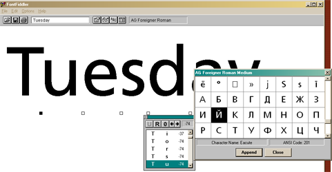
Font: AG-Foreigner-Roman
Font-size: 16
Font-style : bold
Font-Script : Western
I don’t know if AG-Foreigner-Roman is free or not, I’ve only ever found it here: http://font4design.co.kr/module/fontboard.php?subp=view&idx=56&div=design&code=font3&s...ext=&reqPage=2, and it’s a Korean page with no indication of a price. It looks good, and much better than most. If you cant find it or don’t like it, use Lucida Sans or NonSerif.
As for my font size, if these were text based fonts you would use 20+, because of my font and the fact I’m using images 16 is perfect. 18 if I like it a little bigger. Trust me it works out this way even if most people will disagree.
Text-Color: #00FFFF (yellow)
Outline color: #000000 (black)
Outline-size: 2
I know yellow is an ugly font color, but for the sake of my eye-sight its better. White even with a black border is hard to see on some screens and MAY weaken your eye sight, or may not medical journals change daily. All I know is people have told me to stick with yellow as it’s safer on the eyes. Also it’s more visible. Yes it’s ugly so what.
Non-SSA properties
Extra Character Spacing: Unchecked
Line Spacing (%): 0
Italics correction (%): 0
These are self explanatory, I don’t touch them
Allow processing of kerning pairs: Checked
Ligate characters when needed: Checked
Use Diatrics when available: Checked
These are default, I don’t touch them because I don’t know what they do, all I know is what I’ve done so far works so why mess with it.
Threshold 1: 85
Threshold 2: 200
Text %: 50
These are default, I don’t touch them because I don’t know what they do, and all I know is what I’ve done so far works so why mess with it.
Now below you can see a sample, though ignore it as its not too helpful when you cant see the movie or screen size it will be shown on. So let’s go to edit and preview, it make take a while to render this so be patient.
Edit and preview:
Now you can really see how big they will be and how they will look, so change your style if it’s not to your liking.
Generate:
Happy? Press generate and we now have our image subs.
Import the .son file into your favorite authoring application and compile.
I hope my guide helps, any questions, comments, contradictions, criticism, general hate etc are all fine.
+ Reply to Thread
Results 1 to 14 of 14
-
-
two thumbs up!
tks 4 the info
cheers
-CIncrease knowledge, increase sorrow. -
Really fine guide!
I am perhabs a bit dumb , but I don't get the color key table... Could you state that more explicitely? I want to import to DVDLab Pro and my attempts with MaestroSBT so far produced subs with black main text and white outline, although I tried almost 10+ (?) combinations, including the defaults... (Using .son-file + .bmps)
My DVDLab is the 1.6-update-version, perhabs s.th. wrong with that?
Thanks for any help! -
Easier way: In Subtitle Workshop, select all text (Control A),Originally Posted by Afterlife
Edit/Texts/Unbreak subtitles (Or Shift-Control-U).
Then save as SSA format.
Most SRT files, made by OCR, just have typewriter punctuation (' " -). I convert these to true curly left and right quotes and dashes. The forum software screws it up if I try to paste it in here, but it's easy enough to do in a text editor.
Also, this site : http://screenfont.ca/fonts/today/interim/ has some very interesting comments and suggestions for fonts.
The link you gave for AG-Foreigner-Roman is dead, and Google doesn't give anything useful.
I'd want a font that had an italic style, so the software didn't have to fake it. I've used Lucida Fax and Verdana mostly.
PS: As for spelling, you might check your/you're. You have several mixups. -
I found AG-Foreigner-Roman, here you are:
agfor26.ttf
EDIT: Was a free download. -
A normal subtitle stream is only about 10kbps, so a two hour movie should only consume ~9MB of space on your disk. As for space "wasted" with .BMP format? You can use 4-bit compressed bitmaps which take up about the same space as compressed .TIFF. Even a full 720x480 bitmap (needed for Scenarist) that is compressed doesn't take up that much space (the background is mostly one color). MaestroSBT gives you the option of either one (plus a few more).
ICBM target coordinates:
26° 14' 10.16"N -- 80° 16' 0.91"W -
Ok, thanks.Originally Posted by nbarzgar
Now I've seen it, it's not a freeware font, but it obviously is floating around, designed by Andrejs Grinbergs (thus the AG). It's actually a Cyrillic (Russian alphabet) version of the font more often named Frutiger.
see, eg http://www.paratype.com/fstore/default.asp?fcode=175&letter=F
If you have any Corel products, you probably have the Bitstream version, Humanist 777.
Anyway, the point is that because it has Cyrillic characters in the "upper ASCII" positions, you have to be careful if you use, eg, any accented characters, you'll get Russian instead.
-
what do you do if the subs doesn't sync with your the video file after burning it?
-
Hey lienny,
- this is not the right thread to ask this question
- look around the forum a bit more carefully, numerous threads and posts deal with this problem... 8)
- try DVDSubEdit (look for the guides around!!!)
CU -
Hi, Afterlife. Nice guide you wrote, there. Let me clarify about some of the most obscure settings in MaestroSBT, so you can have a complete picture and get the best of it:
Bitmaps: Compressed TIFF
Perhaps you already know this, but this better be clarified: of course, 300 MB of bitmaps is bad; however, the resulting subtitles will always have the same size in the DVD, no matter what bitmap output format you choose on MaestroSBT. That's becase the muxer will have to encode them in MPEG format (RLE compression) inside the DVD stream.
Intelligent Collision
When two subtitles arrive at the same video frame (e.g., two dialogue lines) they may try to occupy the same area of the screen and overlap ("collision"); in this case, MaestroSBT will move up or down one of them to prevent that. Let's say, subtitle A keeps its original position and subtitle B is moved to prevent overlapping A. That's to be expected. However, if several frames later subtitle A dissapears before B (i.e., subtitle A has a shorter duration than B), the collision will be gone too and B would regain its original intended position in the remaining frames, which is not elegant. When Intelligent Collision is checked, MaestroSBT will remember B's assigned position and honor it even after subtitle A dissapears, so B is not moved. The default setting of "checked" is better for most cases, and has no effect if subtitles have straight forward timing.
No Horizontal Collision
When two subtitles arrive at the same video frame (in collision) and their syles or settings for horizontal alignment are different (one is left-aligned, the other is right-aligned), this box checked means that MaestroSBT will not consider them as in "collision". This might be needed for fancy playing with the scritps, but irrelevant for the majority of us mortals.
Collision Foreseeing
This is what SSA called "reverse collision detection". It means that if the subtitles will be A ---> then A+B ----> and then B alone, the collision with B will be contemplated from A's standpoint before it even occurs, placing A above and leaving space for B when it appears. Otherwise (with this unchecked), A will be placed normally and, when B appears, B will be placed above A to prevent collision. This is not natural, as we tend to read up-down. Again, this is only meaningful if you have complex subtitles.
Script Font code page
This let's you ignore the code page set in the style and set your own. Fonts have different glyphs if different code pages are selected. Normally, the SSA script should specify the correct code page for each font.
Multibyte Code Page
I really don't remember what I wanted to do with this. :P The only effect I see in the source is to call the _setmbcp() Windows function before rendering. This might have an impact in rendering multi-byte code page scripts (like Chinese, Japanese, etc.).
Fixed Width
This sets the bitmap width to a different width than the screen's or the text minimum clip area (which is dynamic). This is not very useful, but mind you: if you specify a smaller width than your screen, text might be clipped! This is bitmap size, not screen size.
Full Width
Checking this is the same as setting the "Fixed width" field with your horizontal resolution. Some tools crash or produce unexpected results if you feed them with bitmaps clipped to their minimum size, but accept them if they have the expected width. This is a disk space saving strategy, since you still get smaller bitmaps (clipped vertically). This has nothing to do with the *text* size or positioning of the subtitles.
Don’t clip bitmaps
This is a disk space saving strategy: instead of producing full-size bitmaps (e.g., 720x480), it produces the minimum bitmap size for each frame that doesn't crop the picture. As you say, some tools support it, some don't. Remember: the resulting DVD size will not be affected by the bitmap area at all; this is only for space saving during the authoring process.
Add one pixel before clipping
Instead of clipping the bitmaps right around the area used by the text, when this is set MaestroSBT will leave an extra pixel around that area before clipping, in all directions.
Sticky colors
This is the less understood feature of MaestroSBT. Let's say you have two subtitles: A and B, which appear at different times but meet in between (t+0 = A, t+1 = A+B, t+2 = B), like in the collision example above. Let's say A would naturally be yellow, and B would be white (by style setting), but you selected "Only one set of text antialias and outline colors". These are the two possible scenarios:
1) Sticky Colors UNCHECKED: At t+0, A shows yellow. At t+1 A and B show yellow, or white, depending on which one has the higher priority. At a+2, B shows white. As you see, either A or B change colors in the middle due to the limited color palette restriction.
2) Sticky Colors CHECKED: At t+0, A shows yellow. At t+1 A and B show yellow, as the color from A is "sticky" and there are no other colors available for B. At a+2, B shows yellow, as it has the "sticky" color. This time, titles don't change colors "on the fly", but retain any colors they may have got.
Again, this of course has no meaning if you don't have different dialogues meeting at the same frame.
BG color button
Certain scripts (e.g., I-Author) don't use color keying for background, text, E1 and E2, like Scenarist, but only for the background. This button let's you freely select the background color for that.
Color Keys
This should match the settings on your tool (e.g., Scenarist has defaults but accepts customization). Although permitted, colors should never repeat themselves. If you don't want anti-alias, just select "Two colors for text, one for outline, no antialias".
FPS in, FPS out and Drop Frame
These are used for conversions made from the SSA script. The SSA script uses HH:MM:SS.mmm (with milliseconds), while DVD authoring tools use HH:MM:SS:ff (with frame number). Given FPS in and FPS out the same values (no frame rate conversion), the conversions will look similar to this:
Drop frame should be used for 29.97 (NTSC) and not for 25 (PAL) frame rates. Drop frame is the standard way to deal with decimal values (from the 29.97 FPS).Code:29.970 - 01:45:32.500 converts to 01:45:32:14 (frames count from 0 to 28~29) 24.000 - 01:45:32.500 converts to 01:45:32:12 (frames count from 0 to 23) 23.976 - 01:45:32.500 converts to 01:45:32:12 (frames count from 0 to 22~23)
Allow processing of kerning pairs
This affects how the fonts are rendered. Kerning pairs change how any two character overlaps, and some professional fonts include information about this. This means that the letters will position differently depending on what letters they have before and after, giving a more professional look, especially in large text. Some fonts might be buggy, though, and using kerning pairs could produce glitches.
Ligate characters when needed
Some fonts might include a different glyph for two-character combinations like "fi" (where the dot of the i encounters the top part of the f). These are called ligatures. When unchecked, ligatures are not allowed. Only meaningful for fancy, professional fonts.
Use Diatrics when available
Another font processing option: fonts might have separate glyphs for "a" (letter) and "^" (diacritic), and can combine them together to form "â". Checking this will allow MaestroSBT to use this instead of using plain "â".
Anti-alias thresholds
This fine-tunes character anti-aliasing. Internally, the anti-aliasing produces grayscale values for the borders of the font and the outline. Considering an outline of value "0" (black) and a text of value "255" (white), all values in-between come from anti-alias. Due to the limited nature of DVD subtitles, MaestroSBT can pick only one color for anti-alias, usualy something in-between the font color and the outline color. The "Text %" controls this color synthesis, by applying (X)% of the face color and (100-X)% of the outline color. The threshold values control the resulting pixel color: face, anti-alias or outline. If a pixel renders a gray whiter than "Threshold 2", face color is used. If darker than "Threshold 1", outline color is used. Any colors in-between will use the synthesized anti-alias color.
I'm amazed this program I wrote so many years ago is still being used. It's sad I no longer have the time to work on it. I don't even work with DVDs anymore (and never even seen a Blu-Ray yet). -
So, let's try to refresh your memoryOriginally Posted by guillep2k


https://forum.videohelp.com/threads/279604-[-INFO-]-Maestro-SBT-2-6-0-0-*does*-support-Unicode
https://forum.videohelp.com/threads/304250-How-to-convert-srt-sub-ssa-to-SON-SCR-for-Fi...Cut-Pro-on-Mac
https://forum.videohelp.com/threads/304462-Workaround-for-MaestroSBT-s-R2L-issue
HTH
-
Thank you, El Heggunte. It's a pitty nobody stepped forward offering help checking those scripts I cannot check myself (I can only read a little Japanese, but no Thai, Hebrew, Arabic, etc.). It was impossible for me to find anybody providing good feedbadk those days (other than "it doesn't work"). Then I abandoned the project and for years it was left like that.
-
i use convertxtodvd 3 and it does not seem to support .son
what can i do? -
Maybe use a subtitle format it supports? It supports VobSubs (IDX/SUB), so you can convert the SON subs you made to VobSubs using Son2VSub.Originally Posted by animalia
 Quote
QuoteSimilar Threads
-
Getting perfect AR on wide TV?
By terrypin in forum Authoring (DVD)Replies: 7Last Post: 15th Sep 2011, 16:08 -
DVD to perfect AVI?
By bagmand22 in forum DVD RippingReplies: 12Last Post: 18th Nov 2009, 09:52 -
Why can IVTC not be perfect?
By loekverhees in forum Newbie / General discussionsReplies: 12Last Post: 31st Oct 2009, 17:51 -
'Perfect' MP4 Conversion
By sachin in forum Video ConversionReplies: 6Last Post: 11th Nov 2008, 10:26 -
Is This A Perfect Hiding Place?
By moviebuff2 in forum Off topicReplies: 1Last Post: 6th Feb 2008, 08:29