


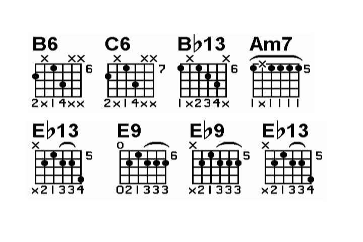
Hi, I'm creating a music instructional DVD which is going to use these chord diagrams on screen.
I've been told to apply the "extremely conservative" broadcast colors filter to it, as well as use the "reduce flicker" and apply a blur to it. Also, this image needs to fit across the screen lengthwise (testing on 4:3) so using the pan/crop to make it smaller makes it harder to see too and increases crawling edges/flicker. If any of the gurus can tell me the best way to make this show up on the DVD where it's easy to see, I'd be very thankful. Also keep in mind that the DVD will be viewed on TVs as well as computers. Reason I say this is because when I applied the blur, it looked good on the TV, but blurry (imagine that!) on the computer screen. Also, this is the hardest one to make work because it has 8 chord grids in one measure. The other images will have less so they can be bigger.
Here is the image (click on image for full size)

+ Reply to Thread
Results 1 to 22 of 22
-
-
IMO this is way too busy for SD TV. Fonts need to be larger (except for the legal disclaimer
 ). Colors should be desaturated yet contrast with the background. Yellow or white work best.
Hint: Go to K-mart and buy the cheapest NTSC 14" set. Avoid one with a comb filter. Connect the set through a VCR using the channel 3-4 RF output to the TV. Use this set to make the text readable and the graphic design work. If it works on that, it will work on anything higher.
Remember, Phil Spector mixed all the Motown music to a car radio with 4" speakers.
Edit: Hmm you changed the graphic. Same issues still apply. Even if it will be on DVD, many still watch DVD through a modulator. A more relaxed standard might be DVD playback in composite NTSC to that cheap TV. -
Hmm, well I am using just a 19" TV connected to my cam and firewire for the preview to external monitor in Vegas. I don't really have a clue where you were going with the "Hint" section of your post? I'm sure this won't be the first DVD with music notation shown on the screen. Just trying to figure out the best settings for ease seeing.
I didn't change the graphic. The forum resized it to fit the width here. If you go to:
http://www.filelodge.com/files/room22/568910/meas1_white.png
You can see the full size image I have to work with. This is what the music notation software exports to so this is what I have to work with.. There are some other options as far as capturing the images. I could pring the music to a PDF and do image captures to a different format if that would help? -
Something like this if you want it to be readable on all standard definition TVs with minimal flicker:
-
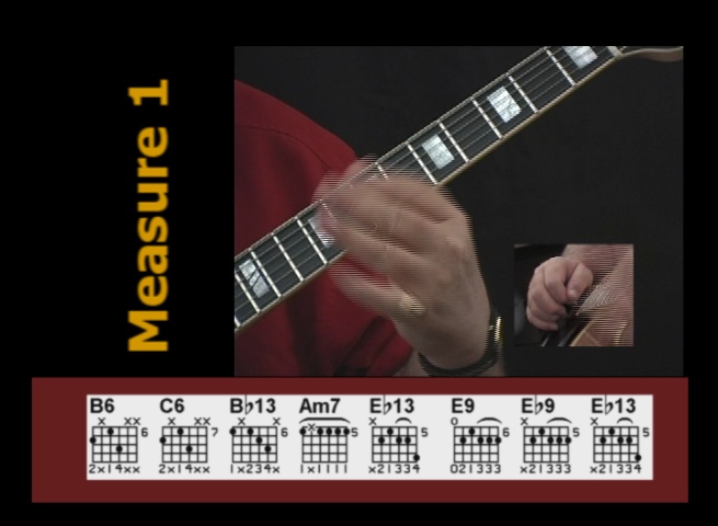
Here's what I made, I think "it'll do"
Like I said, the other images will have less grids, so I can make them bigger and thus easier to see..
(see attached file)
-
jagabo, what did you do? it just looks like you stacked them and made a new image?
I need to have one line because there is more to the frame as you can see in my last post
Notice what I said about the .001 gaussian blur making it look blurry on the computer monitor, but decent on the TV =( -
I scaled and stacked them, put them in a 720x480 (DVD sized) frame, and ran a blend deinterlace filter to reduce the flicker (blurs along the vertical axis only). EVerything is perfectly legible on my 13" TV.
Simply shrinking the original to fit within a 720x480 frame made it too small to read the numbers at the bottom (on the 13" TV). It looked OK on my 31" TV.
Since you need them in one line you may want to use fewer chords at a time so they don't have to be so small. -
What is a "blend deinterlace filter" Is that the same thing as a gaussian blur in vegas? it does give me the option to use horizontal range, vertical range or both. I should only use the vertical range blur?
-
I'm not familiar with Vegas and its gaussian blur filter but if it lets you set the radius for both the horizontal and vertical axis, just blur the vertical axis. The sample you posted looked about right, except that it was blurred on both axis.Originally Posted by sdsumike619
By the way, when I said the text was not legible on my 13" TV, I was exaggerating a bit. I was able to read the finger numbers but it was a bit of a strain. In the context of your production it's probably acceptable to use that size. -
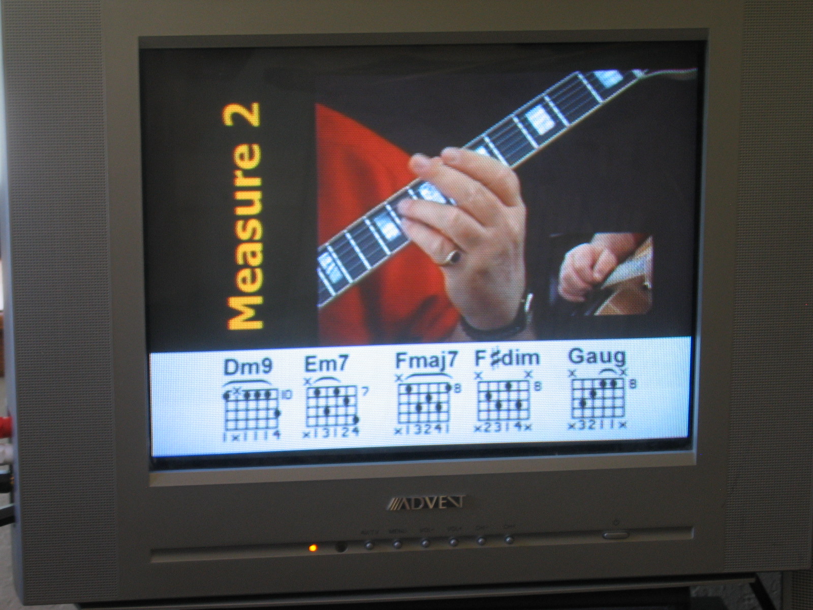
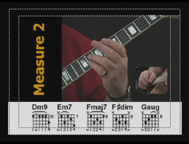
Yeah, I'm not really concerned, it's just one measure that has 8 grids in it... I'm looking at measure 2 with 5 grids and the increased size really clears it up... Let me ask, why only blur the vertical axis?
-
Because you only need to blur the vertical axis to reduce the flicker caused by an interlaced display. You might as well leave the horizontal axis sharp.Originally Posted by sdsumike619
-
That minimally works on the el cheapo NTSC monitor but I felt I needed to walk closer to see the detail. The black over white helps keep the NTSC edge crawl away.
A bit larger would help readability.
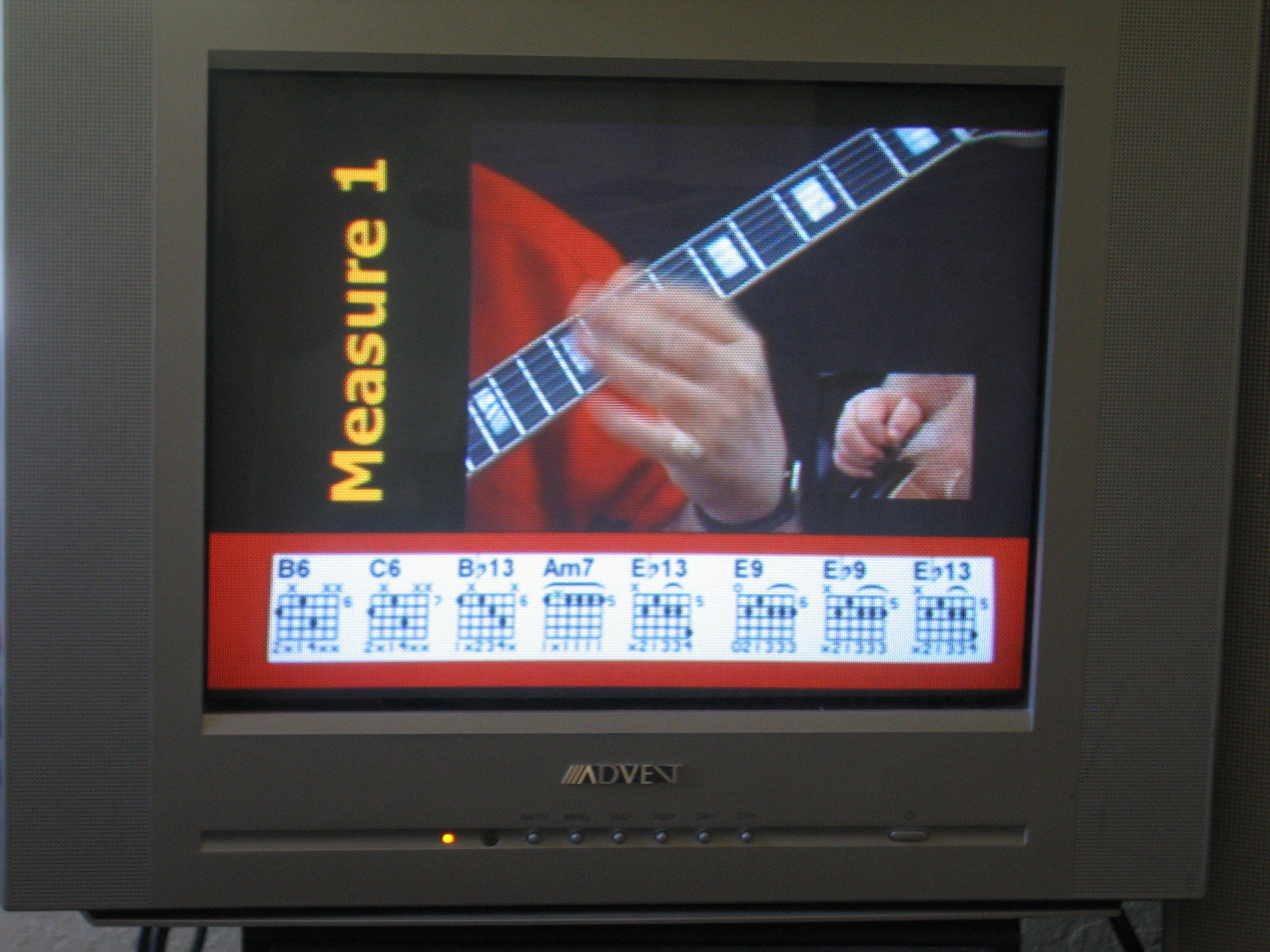
It wasn't quite as bad as it appears in that photo. The still cam adds moire that isn't there when viewed directly. -
I see, well this is what it looks like with only 5 grids, I decided to lose that burgundy color behind the grids and just go with white; only annoying thing is that edge of the image isn't blending in with the white band I put behind it (always something)

Is there any special way of making video in general look good on both the TV and computer monitors? I know about the diff color temperatures basically and that's what causes the video on TV to look bright and crisp while the same video on the computer looks dull/dark...
Oh, one more question,, what is the bottom line with the "safe areas" There's the title safe and action safe areas... why two? What is the optimal setting and do I need both safe areas? -
That is much better for readability. I can make it out from 10 feet on this worse case 14" monitor. ... Actually it would look worse over RF but this is OK.
Again ignor the still camera generated moire. -
alright so this is pretty much resolved, it's not perfect but it's readable which is what I needed it to be.. thanks for the input,,, anything to say about what I asked in the previous post about TV vs Computer monitor screen?
-
Nothing other than what you have there looks good on my computer screen.Originally Posted by sdsumike619
-
Ok, thanks =)
-
Regarding safe areas:
The action safe area is for non-critical picture elements. Some TVs may lose some of the image between the action and title safe areas.
The title safe area is for critical text -- you'd be very unhappy if you paid for a TV ad and found that half the TV viewers couldn't read your phone number because it was outside the title safe area!
You should stick with the title safe area because you want to be sure your viewers can see your chord diagrams. -
That is a very good point. We often get fooled by our new fangled flat screens. Some older sets may loose the bottom row. If the phone number or web URL was down there, the message investment would be lost.Originally Posted by jagabo
In this case the risk isn't that great. -
But I also found that you can change the % of the safe zones... I'm guessing the default settings are the best?
I'm also hoping this looks good on widescreen TVs... I don't have one, might have to make a trip up to the electronic store and put a test DVD in the players to see how it looks =) -
The safe zone % defaults are industry standard practice. Old sets were factory set just outside action safe area. As the set aged, the picture used to grow larger (aka picture tube bloom) due to non-linear component aging in the power supply and phosphor dimming. As the phosphors aged, the user would turn up the contrast causing the high voltage power supply to drive harder, thus causing power supply parts to wear out.Originally Posted by sdsumike619
Newer sets have more power supply precision so the picture can be adjusted closer to the edges.
I wouldn't worry about 16x9 sets. The user will select side pillars or let it stretch horizontally. -
any idea how I can make a small box or something to "highlight" each chord as it's played? I tried using the media generator to make a yellow box, make the transparency 40% resize it with pan/crop, but the box ends up being too small and falls out of the frame when I pan it.
edit: I also tried creating a yellow rectangle as a graphic and dropping it on the timeline and using pan/crop but same problem, the left and right most chord grids are out of the frame of the highlight graphic... Can this be accomplished with pan/crop?

 Quote
QuoteSimilar Threads
-
sony vegas avchd to dvd -project settings confusion
By baross in forum EditingReplies: 6Last Post: 11th Aug 2010, 09:20 -
Best render settings for DVD in Vegas
By harishfx20 in forum EditingReplies: 4Last Post: 11th Aug 2010, 01:16 -
Correct Settings in Image Burn for HD-DVD?
By wulf109 in forum Blu-ray RippingReplies: 1Last Post: 17th Jan 2009, 17:01 -
Vegas 8 - replace an image with image from previous frames
By sdsumike619 in forum EditingReplies: 2Last Post: 5th May 2008, 14:26 -
Vegas - add image to video (DVD(mpg)) and moving image around
By psxiso in forum EditingReplies: 4Last Post: 11th Jul 2007, 04:29