


I'm planning to put a now 15 year old film on the by us all known videostreaming site.^^
But here my problem, it's a cartoon, one of the last hand-drawn ones and I noticed that whoever encoded the movie digitally seemingly had no idea of it. The two main problems are, the colors are oversaturated and everythings looks a bit darker as in the original version and second the outlines of the characters are a little thicker and that annoys me, so before I start on reencoding it I most importantly need to know how to get the outlines thinner, the oversaturation comes second.
Thanks for your help
+ Reply to Thread
Results 1 to 30 of 72
-
-
What video format is this and how are you viewing it?Originally Posted by waefwaeefwaefwRecommends: Kiva.org - Loans that change lives.
http://www.kiva.org/about -
Oh sorry, right I didn't mentioned it...it is DVD...though I would be better off with the VHS original.
-
Oversaturation, brightness, and contrast are easy to fix. Just about every video editor allows adjustment of those properties. I doubt there's anything you can do about the thickness of the outlines. Posting a sample frame might help.
-
I suggest you view this DVD on an adjusted TV before you adjust. Computer monitors display overly dark unless you use a good software player that adjusts video for RGB display with proper computer gamma.
If you adjust to the computer display, it will go too bright on the TV.Recommends: Kiva.org - Loans that change lives.
http://www.kiva.org/about -
But he's uploading to Youtube(?) so he probably doesn't care how it looks on TV.
-
To add to EdDV's caution, above:Originally Posted by waefwaeefwaefw
It's important to state a bit more detail, especially, what kind of monitor are you using to view this DVD? Whether you're using a PC monitor or a TV, each device must have some level of at least basic bright/contrast/tint calibration. A calibration of a PC monitor with Spyder2 or EyeOne colorimeters and software would be better, though a calibration DVD disc would be better than nothing. If you're using an analog TV, the VHS tape should look about right (unless its inherent brightness and color levels are screwy to begin with). If you're using a digital HDTV, any CCIR601 standard-def analog source is going to look dim and oversaturated except on those few HDTV's that have decent SD and HD color-space detection circuits. Also, the dimmer an image is on most LCD or HDTV monitors, the more it will appear to look oversaturated. If you do try some correction work, start with the brightness (black-level) and contrast (white level) before attempting any kind of color correction.
Keeping all this in mind, your video needs to be viewed on a device that has been calibrated to some standard. If all your other VHS tapes look good on your viewing device, then there's likely something amiss with the dim DVD transfer.Last edited by sanlyn; 20th Mar 2014 at 12:18.
-
Be certain that it has nothing to do with color calibration of my monitor - I watched it on the TV Screen...
PS I have to deal with color calibration a lot -
From the colors I can see it has nothing to do with the calibration - the source really is oversaturated, but how do I get the lines sharp again?
-
A sharpen or edge enhancement filter. Most video processing software has this too.Originally Posted by waefwaeefwaefw
Posting a sample would be helpful. -
Oversaturation I can understand. How the lines were thickened is still a mystery. Maybe it's a mental block for me, but does anyone have an idea what could have caused it?
Last edited by sanlyn; 20th Mar 2014 at 12:19.
-
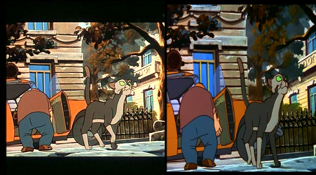
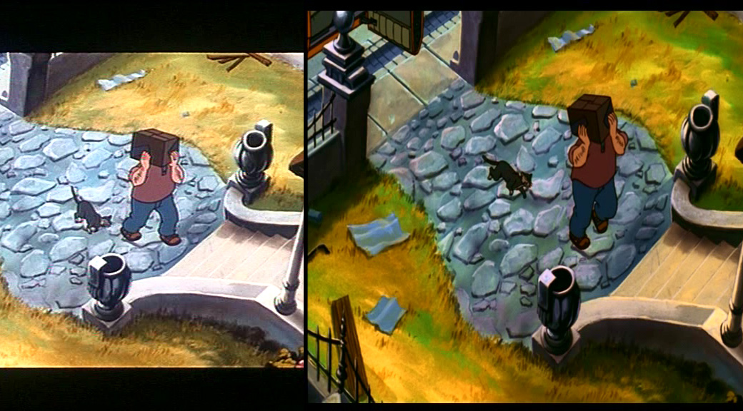
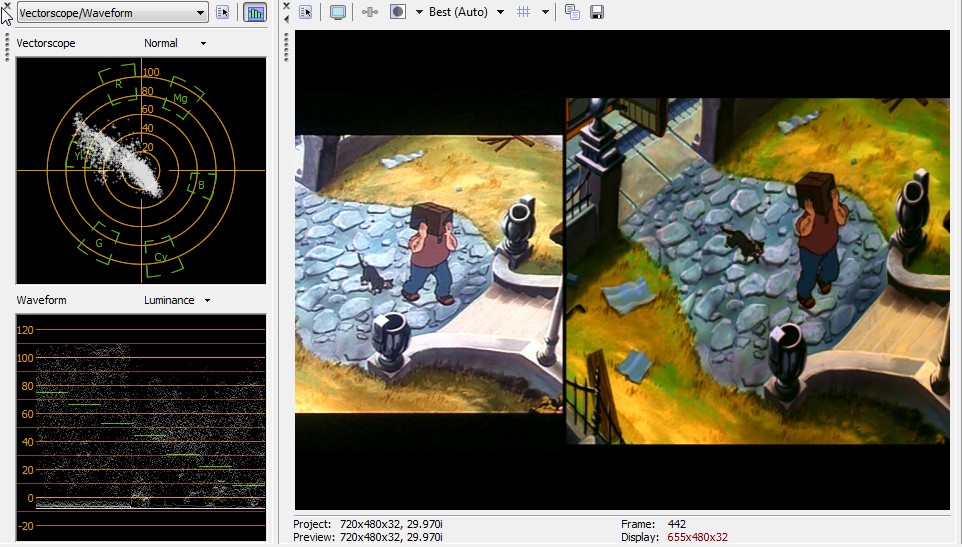
OK here some examples
-
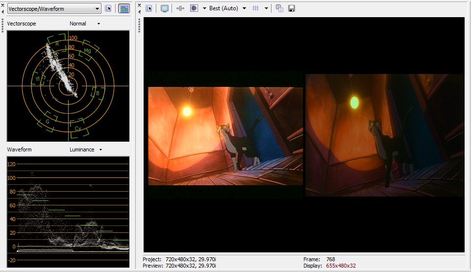
2nd example
-
Ok now I know why the lines are thicker - it is forced into 16:9 even it naturally was 94 a 4:3 film - simple but I'm stil missing the crispy outlines rom the original
-
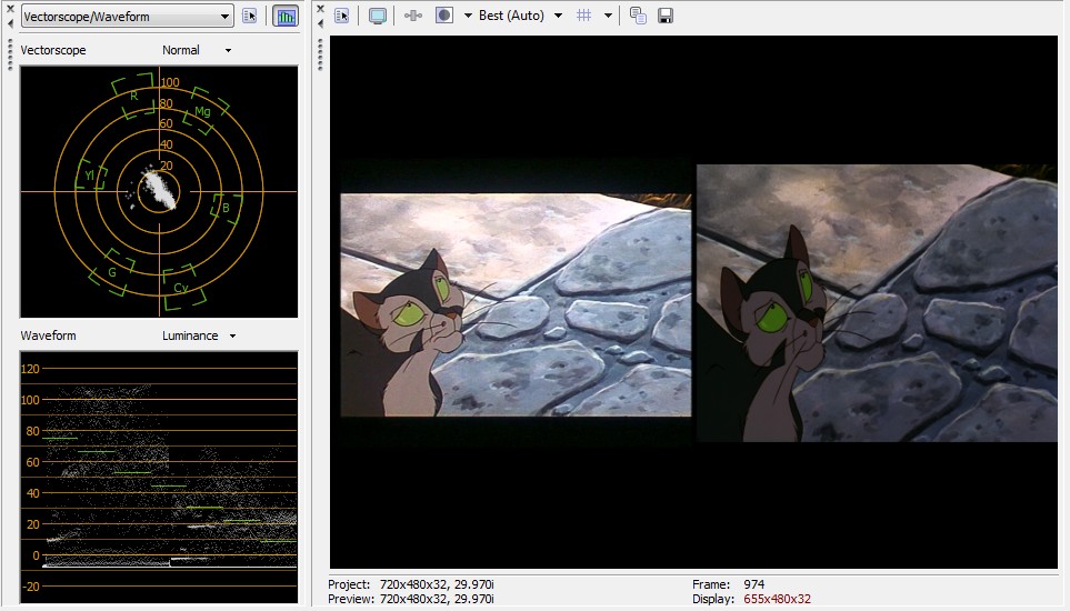
What exactly are we looking at in those samples? I assume the images on the right are the DVD rips. But where do the images on the left come from? And why the unusual frame sizes? How did you create them? The images on the left have poor black levels and are overblown in the bright areas (for video).
-
don't ask me how that comes...on the right it's the trailer from the DVD, the left is also from the DVD but from the main movie
it maybe that is a bit poor in the black areas but I would rather like to have that old feeling to it -
aH sorry vise-versa
right is the main movie
left is the trailer from the dvd -
So you want what's on the right to look like what's on the left -- in terms of color/brightness?
-
yep - I have really noticed that it isn't as good as the original when it comes to the feeling the film orginally had....
-
Getting an exact color match will be very difficult because of all the non linear differences. But here's the image after some adjustments in VirtualDub:
-
Nice work, jagabo. Looks like you're on the right track.
Waefwaeefwaefw (man, I had a good time trying to get that spelling right!): I'm still a bit confused about what you're showing us and the history behind this video, but I'll hazard a guess or two. The screen captures display a different image ratio; the letterboxed left-hand panel is the effect you're trying to achieve, the right-hand image is wide-screen squeezed into 4:3 ratio (but when you play it back on a wide-screen display it will stretch into wide-screen).
Are these captures from a commercial DVD or from a DVD that was transferred from VHS? The right-hand panels don't look like VHS; the left-hand panels have edge bleeding, edge ghosting, and color noise reminscent of VHS artifacts -- but I've seen plenty of trailers and ads on commercial DVD's that look much worse.
In any case, the "trailer" portions you find on VHS and DVD seldom look the same as the main program material. In fact, most trailers you see in movie houses often don't look anything like the actual movie.
Anyway, take a closer look at the colors and contrast in the right-hand panels. The oversaturation isn't that bad, but one major problem is that the color balance on the right has far more green that the panels on the left. In fact, if you desaturate the right-hand panels by a mere minus 10%, the image won't just look less saturated, it'll look pale and even "darker". If you use a simple "brightness" adjustment toward the lighter end, the image will simply look washed-out.
Here's another consideration. Look at the top picture and its left-hand panel. What color is this cat supposed to be? On the left side the cat is dark and light tan. On the right side, the cat is two shades of olivish green. Overall, the panel on the left has more red; on the right, there's far more green. Also, in the left-hand panel the man's slacks are a grayed greenish-blue; on the right, the slacks are closer to blue.
I've looked at these captures using color diagrams and histograms in Photoshop, VirtualDub, and TMPGenc-Plus. If anyone can guess what color the cat is supposed to be, that would be your first clue as to the correct color balance you could try for. But in every frame, the cat is a different color. In the "trailer" in the lower, right-hand panel, the cat is gray with a tinge of purple, and brighter paws look blusih-white.
If you keep looking at the colors of distinct objects in the upper capture, you start noticing strange things. (a) In the upper capture, look at the bricks in the window frames of the building on the right-hand side of both panels. In the left-hand panel, the top crowns of the windows are tan, and some details of the horizontal lines in the masonry are missing. In the right-hand panel, the window crowns are brighter and closer to white, and there's more detail in the masonry. (b) in the upper capture, just to the left of the man's shoulder, look at the car's roof and the color of the building in the background. The color of the inside of the car's roof is different in each panel, and in the left-hand panel there's a tan chunk of masonry that looks purple in the right-hand panel. (c) In the upper capture, the color of the ground the cat stands on is different in both panels. (d) I still think the cat's "real" colors would be a fairly reliable guide to color balance and sat levels, along with the guy's flesh colors (the latter looking completely different in every panel). Another guide would be distinct objects that you know should definitely be white, or close to it, which could give you a clue as how far off-balance the brights might be. As jagabo mentioned, any transfer from VHS source is plagued with a nonlinear color and contrast response.
As for bright/contrast levels: the right-hand panels have more retained detail than the left. In the lower captures, compare the shadowed and darker details in the stairs; on the left side, some detail is burned out. Also, take a look at what appears to be old sheets of newspaper (?) in the grass. What color is this debris supposed to be?
I'm getting the idea that the brighter colors on the left are what you want in the final product, while the retained detail on the right is a guide to adjustment in the brightest and darkest areas.
Histograms and spot-checking of the RGB colors of individual pixels and picture areas are showing me that the black levels -vs- white levels in all panels are out of whack and completely different from panel to panel. The right-hand panels show conistently suppressed midtones and closed-up shadows.
Oh well, I've worked with worse. I'd set to work by converting the DVD to AVI and get into VirtualDub. I can see immediately that the gradation filter for VirtualDub would be very handy, and likely could be the only filter you'd need. I doubt that simple bright/contrast/hue filters would give you what you want.Last edited by sanlyn; 20th Mar 2014 at 12:19.
-
waef, you complain about chroma saturation but the issue appears to be luminance levels and gamma, not saturation. You need to fix luminance first. This is usually the case with YCbCr video, >80% of "color" issues are caused by shifts in luminance gain, black level or gamma.
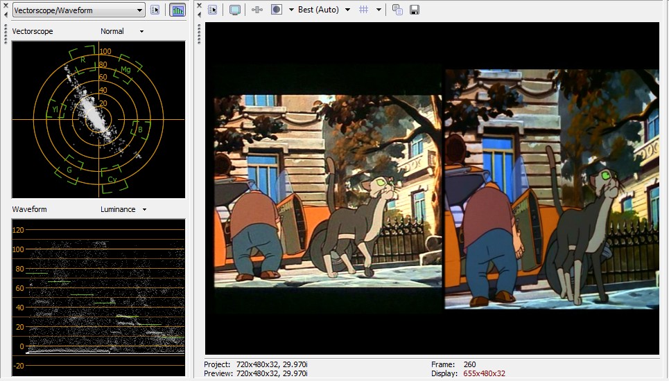
none of these are correct video levels.
 Recommends: Kiva.org - Loans that change lives.
http://www.kiva.org/about -
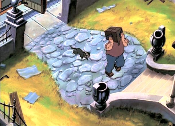
Note that the image I uploaded was a rough attempt to recreate the left hand sample -- with similar overblown highlights and bad gamma. Not an attempt at correct levels, etc. I think the right hand images, asside from being too dark, are probably much close to the what's on film.
-
ok here are two more examples just want to make clear how that sometimes turns out in the movie
ex1.jpg -
nr 2
ex2.jpg -
Interesting! Most people want to do the opposite to what you want to do, you to want to "undo" the restoration and add noise, for the "original" look
-
all in one

-
@poisondeathray
Yeah well I just recently rediscovered that film, the last time I saw that film was like 6 years ago and I noticed while I was watching it something essential was missing, I didn't know what but after the film was over and I watched the bonus section and stumbled upon the original Trailer I then knew what was wrong with the movie. The film really lives from that kind of contrast, that very energetic and also friendly red tones. I actually don't want to "add" artifacts, no, I really want to keep the digital quality of it but give it back that feeling that was essential to the movie! -
Ex1 shows shift of luminance down about 10IRE at black and about 20IRE at white with linearity and gamma shifts.
Any black below zero will be crushed (not shown) on a properly adjusted TV.
 Recommends: Kiva.org - Loans that change lives.
http://www.kiva.org/about -
Can you explain what you are doing to get these results? It is opposite to what you want for streaming video to a computer.Recommends: Kiva.org - Loans that change lives.
http://www.kiva.org/about
 Quote
QuoteSimilar Threads
-
How can I show subtitles on the the top line and on the bottom line.
By Dracko in forum Authoring (DVD)Replies: 14Last Post: 8th May 2014, 15:03 -
RF Modulator with S-video line-in or composite line-in?
By Disco Makberto in forum RestorationReplies: 30Last Post: 24th May 2009, 16:11 -
DVD dual layer media ~ thickness/price
By Micker_C in forum Newbie / General discussionsReplies: 10Last Post: 6th Nov 2008, 00:23 -
i bought 3 movies on line but they don't download they play from on-line
By N8DOGB4000 in forum Video Streaming DownloadingReplies: 6Last Post: 10th May 2008, 17:20 -
Is there way to adjust frame thickness in DLP v.1.53?
By Neisse in forum Authoring (DVD)Replies: 0Last Post: 3rd Jul 2007, 23:07