


I really like the Blue option, except there's not enough difference between the unread (blue) text and read (black) text in the thread lists to make them easily identifiable.
Try StreamFab Downloader and download from Netflix, Amazon, Youtube! Or Try DVDFab and copy Blu-rays! or rip iTunes movies!
+ Reply to Thread
Results 91 to 107 of 107
Thread
-
Member

- Feb 2002
- West Mitten, USA


"Shut up Wesley!" -- Captain Jean-Luc Picard
Buy My Books -
I'm a MEGA Super Moderator

- Aug 2000
- Sweden
-
Blueished the links a bit, test Testing dfdsfsf dsf
-
More pixels 980 default = Nice! thank you

Darker gray (grey) in Classic style, instead of bright gradient, much better, easy on the eyes. Even the red shade feels right. Home again!
-
I posted in a thread today and noticed that the "preview" and "submit" buttons are now shifted left. I'm sure that up until yesterday that they were centered. Is that intentional?
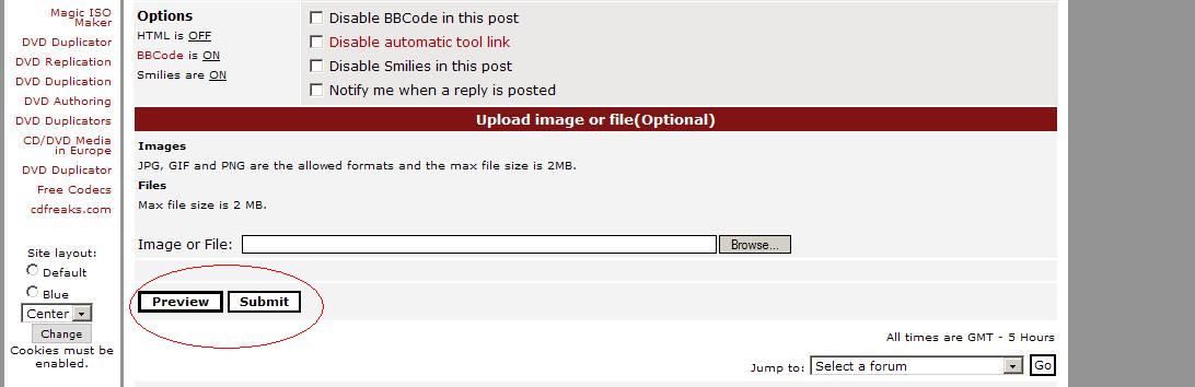
I'm using the classic left style. -
At work I use an older laptop running at 1024 x 768 with FF2.0.0.6. I have my profile set to display at 100% width. For the main forum index this works without a hitch. But when I go into a post, this width seems to be ignored. Now I know that some images are wider than the display area, and I am OK with those displaying, or forcing the width to be wider, than the screen resolution. However this is happening with posts that contain nothing but text. The really curious thing is that if I then use the side menu controls, select Blue and Center and click Change, the post redisplays at 100% width, nice and clean. Odd.
Edit : It also doesn't make a difference if I set my preferred width to 980 pixels in my profile. Again, it only seems to affect the forum indexes, but not the posts.Read my blog here.
-
I'm a MEGA Super Moderator
- Aug 2000
- Sweden
-
guns1inger: Try remove all cache in firefox and restart it.
-
I'm a MEGA Super Moderator
- Aug 2000
- Sweden
-
No it wont help, it seems to be some other strange bug.
-
Wow, those last changes look great!
 I noticed the gradients right away. (Or am I hallucinating?
  )
)
-
I'm a MEGA Super Moderator
- Aug 2000
- Sweden
-
guns1inger: I think it was the quick reply textarea width that caused it. Do you notice any difference now?
redwudz: Hallucinating.....
-
Probably.
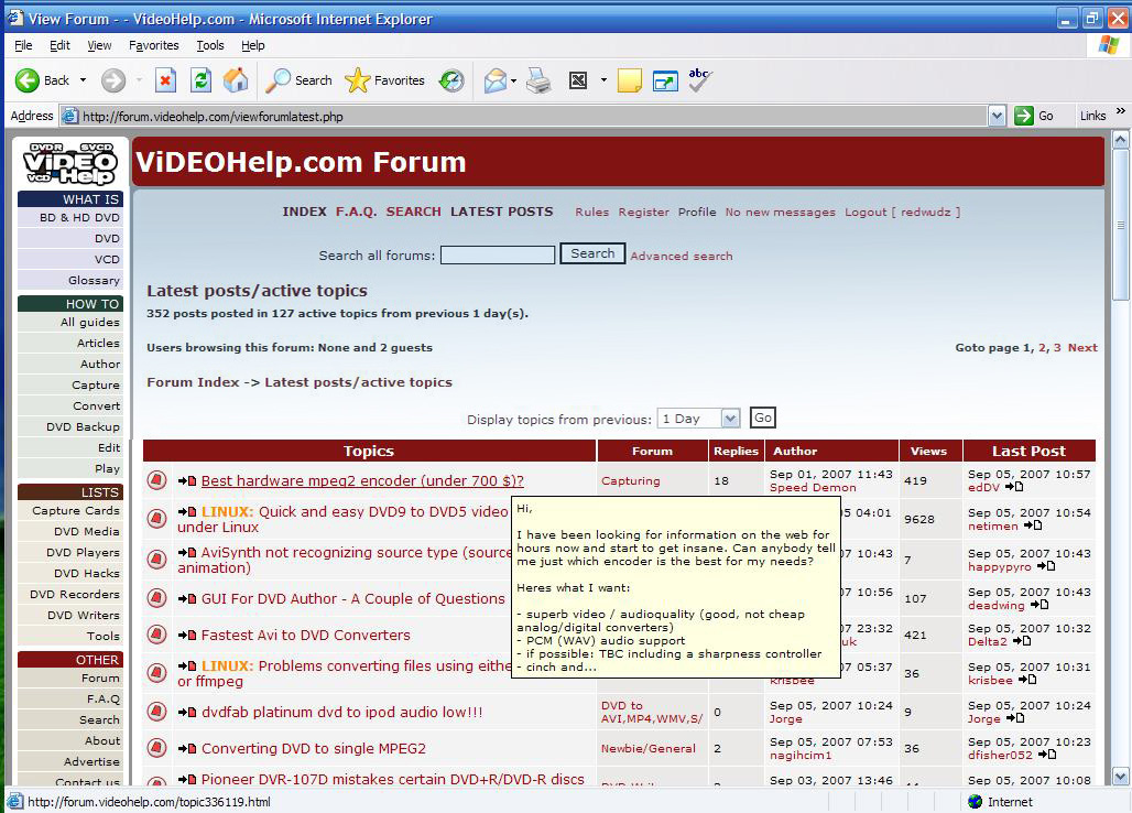
It was late and it may have been something with my laptop. Looked kind of like this:
-
The gradients are cool ! I personally prefer the default look grey-white-red colour combination. It gives more contrast to the page.
Nevertheless the site appears new while retaining its functionality. -
It's nice to have the quick change option.Originally Posted by sanjayk
I use and prefer the default left the way it is right now.
I don't like the blue the way it is now but found it very good the way it was before the last change. I was tempted to switch over until the last change was made.
[s:90acbe6639]IMO The lightest blue/white in the text area is just a bit too bright.[/s:90acbe6639] The rest is ok but it was perfect before except the links didn't stand out enough.
Edit: My bad. I was on a page with a large quoted text so there was a big section of white and that fooled my eyes after swicthing over from the default. The front page looks great and after browsing a bit my eyes have adjusted more so it looks pretty good.
Btw) The blue borders are a very good shade -
One more cosmetic change may be done. The starting page of the site has rounded headers which look nice.
However, when we click on, for example, the Forum link, then the headers appear as rectangles as before. If they are also made rounded, i think, though its a small change but will look different.
-
I like the new style
but I think you missed one thing. I use the blue site layout. If I vote in a poll, the "your vote has been cast" screen that shows up for a few seconds is in default layout. When it disappears everything goes back to blue again. It's not the end of the world but it looks a bit strange.
In the beginning the Universe was created. This has made a lot of people very angry and been widely regarded as a bad move. -
Baldrick, are you still looking for a new logo? Would you be interested in a design like this? The color scheme could be modified for the different board styles available.

-
That's got a kewl retro 60's feel to it. I kinda like it!Originally Posted by adam
- John "FulciLives" Coleman"The eyes are the first thing that you have to destroy ... because they have seen too many bad things" - Lucio Fulci
EXPLORE THE FILMS OF LUCIO FULCI - THE MAESTRO OF GORE
-
I can see it painted on the doors of the official Video Help 1958 Plymouth Fury
Read my blog here.
 Quote
QuoteSimilar Threads
-
How to create logo using aegisub
By Mildragon in forum EditingReplies: 2Last Post: 25th Oct 2011, 03:28 -
cover design software
By butterflies in forum Authoring (DVD)Replies: 17Last Post: 26th Jan 2010, 00:56 -
Web design software.
By Moonstomp in forum ComputerReplies: 6Last Post: 2nd Jul 2008, 13:26 -
how can create sub/idx with my logo ?
By persiansubtitle in forum SubtitleReplies: 0Last Post: 14th May 2008, 11:25 -
Would you design your own hardware if you could?
By yoda313 in forum PollsReplies: 5Last Post: 25th Jun 2007, 20:35