


I have spent the last 2 years trying to come up with a new fresh design but I haven't been able to come up with something good. I'd used to have help with the design but they got real jobs...
I would like to keep the design simple, a menu to the left or at the top and new colors. Using CSS it would be possible to keep the old look for those who would like that and also use different colors. A new logo would also be nice.
Are you interested in helping me create a new design? or a logo? Then PM me or reply here.
Try StreamFab Downloader and download from Netflix, Amazon, Youtube! Or Try DVDFab and copy Blu-rays! or rip iTunes movies!
+ Reply to Thread
Results 1 to 30 of 107
Thread
-
I'm a MEGA Super Moderator

- Aug 2000
- Sweden


-
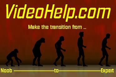
How about this for a logo:

I just made it about 5 minutes ago.Got my retirement plans all set. Looks like I only have to work another 5 years after I die........ -
Serene Savage

- Mar 2004
- Controlled Chaos
-
I have some free time on my hands lately so I offer my skills...
(Would love to noobify the front page a bit...)
With so many people frequenting this site I'm sure you'll get alot of diverse tastes as to what's considered "something good". What's important is what you like and I wonder if you could give us some examples of the direction you want the look to go in?
(Ultimately, it's like interior decorating. You pick one thing you really love and design the room around it.) -
I just would like to make one comment ...
This website has a "design" or "structure" that I find very easy-to-use. Maybe it is because I have been around for so long BUT really I think it is the layout of the site.
If you want to re-vamp the look then by all means do so (although I would be fine with a new logo and no other change) but please don't destroy the functionality of the site by ruining the layout ... in other words don't make it hard to navigate.
I can't tell you how many other forum groups I visit (and sometimes post to) that have a layout that makes it very difficult to figure out or get to where you want to get to etc.
To be honest I can't tell you why I find this site so easy to navigate compared to other forum website but that is the way it is for me.
- John "FulciLives" Coleman"The eyes are the first thing that you have to destroy ... because they have seen too many bad things" - Lucio Fulci
EXPLORE THE FILMS OF LUCIO FULCI - THE MAESTRO OF GORE
-
AGAINST IDLE SIT

- Jan 2004
- Stadium Of Light
-

only joking -
If you have any intentions on using it I'd wait until phpbb3 comes out, save yourself some work . It's in beta5 now, RC1 is possibly next.
No offense but... that or any animated logo would drive me nuts (besides ones with pop up elves :P ). I'd have to put tape over that part of the screen.Originally Posted by racer-x
When designing any graphic for a website it should not be so distracting that it draws the viewers attention away from the content. Especially on a site like this where the content is all text. -
Hey what can I say......I like spinning wheels................................
Got my retirement plans all set. Looks like I only have to work another 5 years after I die........ -
All of that, exactly as it is, goes for me too. Seriously - FulciLives has totally encapsulated how I feel about the look , feel and usability of the site.Originally Posted by FulciLives
If you want to change anything, only the logo could be changed, but...
Originally Posted by thecoalmanThere is some corner of a foreign field that is forever England: Telstra Stadium, Sydney, 22/11/2003.
Carpe diem.
If you're not living on the edge, you're taking up too much room. -
I'm a MEGA Super Moderator
- Aug 2000
- Sweden
-
thecoalman: Good idea.
nwo: You are hired.
racer-x: You are fired.
daamon and fulcilives: I like the structure too but it would be possible to make it even better...it looks a bit 1999....
Shadowmistress and all: I would like to keep the menu in some way. It's mainly the color schemes I would like to make better and maybe get rid of the fixed site width. And yes the front page isn't the best looking one either. -
The "beauty" of the site is the link density per square inch. There is a lot of info available on screen with this layout. I hope you are able to preserve the basic structure if you make changes to the site. Some layouts that might look nice can also reduce the amount of info and links on screen. In any case, we all appreciate the wonderful job that you have done with this site.
-
An interesting "VideoHelp.com mousepad" theme:

-
Recommendation: if you're going to do an overhaul, at least set up a "test" layout in parallel with the current site first. This will allow you to receive comments and suggestions on the layout first instead of springing the whole thing on an unsuspecting public. Even if the site improves flow and nagivation a thousand-fold, simply pulling a "f**k you, we go now!" (like many other sites have done) will cause more irrational anger than anything else you could possibly do.
 Don't sweat the petty things, just pet the sweaty things.
 -
I'm a MEGA Super Moderator
- Aug 2000
- Sweden
-
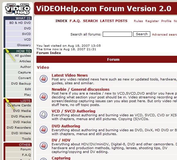
I have finally started working on a new design. I wont change that much, I just want to make it fresher but still keep the same simple menu navigation.
- Centered site
- Less tables, the main structure is div layers
- Rounded corners ( web 2.0... )
http://beta.videohelp.com/ (It's just a static front page)
I'm currently working on the colors, now it's basicly the same but a bit brigher. I will probably keep so you can use old color layouts. -
I like those Nifty Corners a LOT!!!!
SVCD2DVD v2.5, AVI/MPEG/HDTV/AviSynth/h264->DVD, PAL->NTSC conversion.
VOB2MPG PRO, Extract mpegs from your DVDs - with you in control! -
Member

- Feb 2002
- West Mitten, USA
-
I like the new look but I'd like to make a color suggestion. I like to see the threads that haven't been seen to be something other than red and then switch to red after viewing (get it? Red means Read)
"Shut up Wesley!" -- Captain Jean-Luc Picard
Buy My Books -
Nice.
I think that's a great compromise. It still looks modern but we don't have to be 'retrained' to use it.
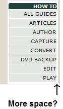
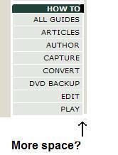
One minor note that I've noticed before. On the lists to the left, the text is butted up against the right margin. A tiny bit more space might look better. JMO, though.
Modified:
-
I'm a MEGA Super Moderator
- Aug 2000
- Sweden
-
You can now test the new layout in the forum, under your profile change the Board Style to Beta. It's far from finished and I will update it every minute...
chrissyboy: Yep, niftys corner javascript is nice. I don't have to make 344 background corner images.
redwudz: Added 3 pixels space.
-
Hi,
I liked the look of the beta page a lot. Nice and clean, it looks updated not renovated, which seems to be the idea. I really miss the colour coded OS descriptors. If I could suggest something it would be a more unified theme (ie sometimes Linux is green, sometimes it's yellow) for the different applications for different OS's I realize there is a lot of cross-platform stuff (and more on the way) and it would have to be uniquely styled, but just a suggestion.My Site: http://www.bandshed.net/AVLinux.html
My Guide: https://forum.videohelp.com/topic330839.html -
I like the new look but is it me or is it now a bit too bright? There seems to be an abundance of white. Maybe the background could be something other than white ... like an "off white" or a very pale yellow or even a pale beige color. Just a thought.
- John "FulciLives" Coleman"The eyes are the first thing that you have to destroy ... because they have seen too many bad things" - Lucio Fulci
EXPLORE THE FILMS OF LUCIO FULCI - THE MAESTRO OF GORE
-
Thanks, Baldrick. The little bit of space seems to make the text stand out better to me. Not so 'crowded'.
EDIT: The latest modifications look even better.
-
I'm a MEGA Super Moderator
- Aug 2000
- Sweden
-
I'm not done with the colors yet. But yes it's a bit too bright now.Originally Posted by FulciLives -
I agree. That was my first thought also. A large bright white page is really hard on my eyes.I like the new look but is it me or is it now a bit too bright? There seems to be an abundance of white. Maybe the background could be something other than white ... like an "off white" or a very pale yellow or even a pale beige color. Just a thought.
-
I would also like to use a little more of the total page width. My laptop runs at a miserly 1024 x 768, so I like ot use 100% of the width if possible. Otherwise it is looking very cool.
Read my blog here.
-
The new look is cool while still retaining its high functionality & usability as before. I feel the color scheme colud be a little more brighter.
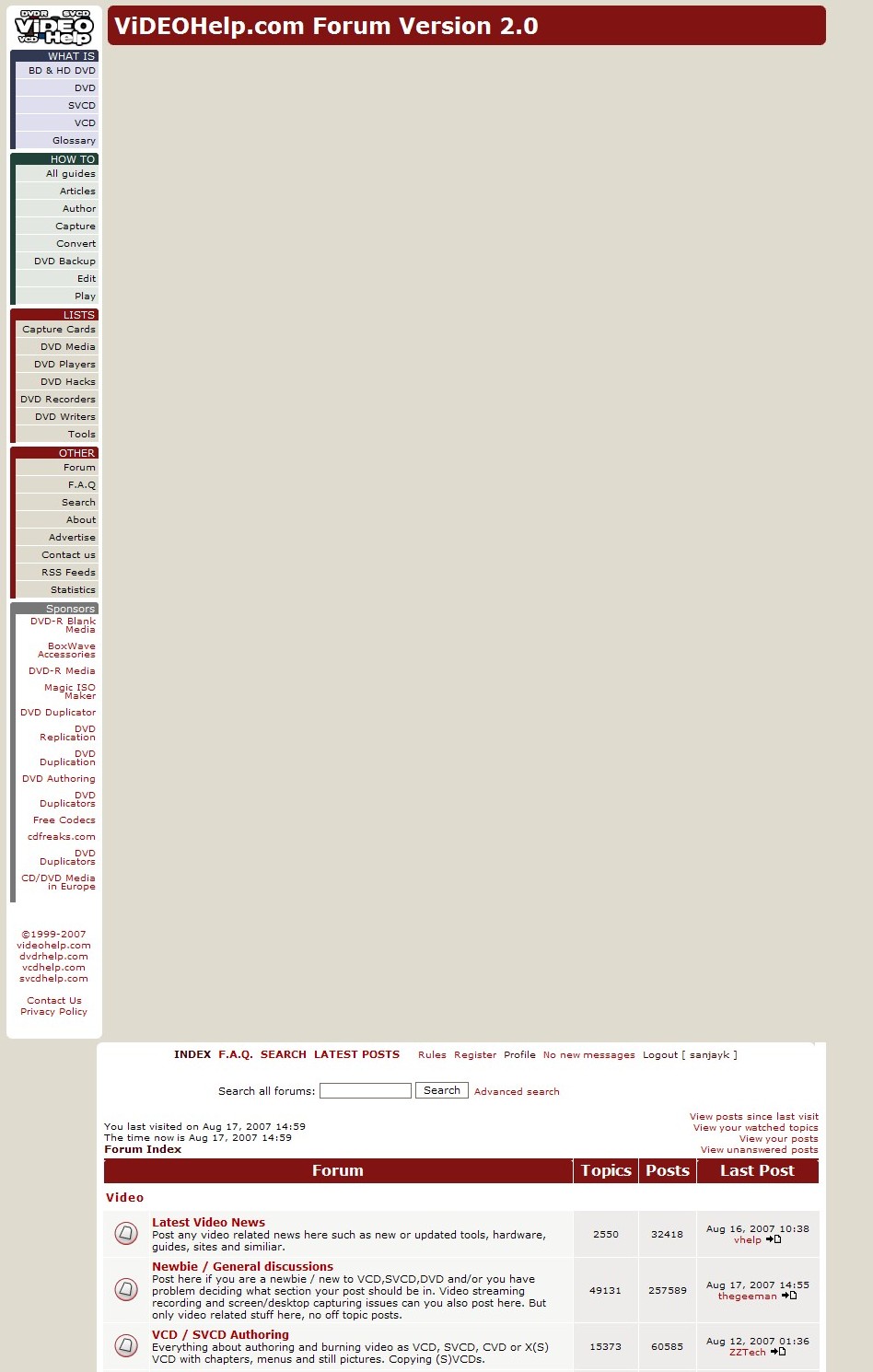
However, the beta version is appearing like this in my IE7 browser. Any ideas why ?
 When I was born I was so shocked that I could'nt speak for 18 months.
 -
sanyak: Yep, same in IE6...i'm working it.
/Baldrick -
video help beta is appearing properly in Firefox 2.0.0.6
 When I was born I was so shocked that I could'nt speak for 18 months.
 -
Love the Beta page, but I have had to switch back to the standard layout. Because it doesn't yet expand to use the full width of the browser window, and because it doesn't wrap the posts correctly, I and finding a lot of posts are getting cut off at the right-hand edge.
Read my blog here.
-
I'm a MEGA Super Moderator
- Aug 2000
- Sweden
-
guns1inger: I'm working on that. I thought it would be easy to switch to div layers but it looks different in all browsers.
 ....
....
-
The side pane is also appearing disjointed in IE7
 When I was born I was so shocked that I could'nt speak for 18 months.
 -
Wasn't trying to be pushy. I appreciate all that you do, Baldrick. Of course life would be much easier if standards were in fact, well, standards. Unfortunately, in the history of IT standards seem to be little more than recommendations that developers take as a starting point, then go off in their own direction anyway. Hell, if standards were really standards then USB would work and firewire cameras would all be hot-pluggable, and not just hot-pluggable except for the bit in the fine print that says you have to turn everything off first, unplug it from the mains, take it to a static-proof room, and put on cotton booties before plugging it in and if it still burns out you are not covered by warranty because the warranty doesn't actually cover using the camera for any purpose for which it was designed
Read my blog here.
 Quote
QuoteSimilar Threads
-
How to create logo using aegisub
By Mildragon in forum EditingReplies: 2Last Post: 25th Oct 2011, 03:28 -
cover design software
By butterflies in forum Authoring (DVD)Replies: 17Last Post: 26th Jan 2010, 00:56 -
Web design software.
By Moonstomp in forum ComputerReplies: 6Last Post: 2nd Jul 2008, 13:26 -
how can create sub/idx with my logo ?
By persiansubtitle in forum SubtitleReplies: 0Last Post: 14th May 2008, 11:25 -
Would you design your own hardware if you could?
By yoda313 in forum PollsReplies: 5Last Post: 25th Jun 2007, 20:35