


Alright...I'm working on a lab and things arent going the way I want them to.
Normally it just lays the x values down where they should be but for some reason it automatically put it on top. Any way to get em back down?
Also, I need to display the equation on the chart. I go to chart -> add trendline -> options -> display equation on chart. Is there any way to have just the equation on the chart w/out the trendline?
+ Reply to Thread
Results 1 to 5 of 5
-
-
Master of Time & Space

- Feb 2004
- Denver, CO United States


You need to have the graph highlighted and click on it. Then you need to format it and move the x axis labeling to the bottom. There's also a way you can add text and place anywhere on the chart while it's highlighted. Just try clicking and typing and see if it adds a text box.
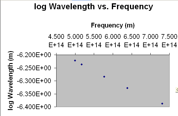
BTW, that chart makes no sense. It shows the wavelength increasing when the frequency increases. The opposite is true. Also, "m" is no unit of frequency I'm aware of
-
www.mrexcel.com/board2
Very clued up people -
Look closer...it's not wavelength but instead log wavelength. As for m, That's my fault which I caught later. It's supposed to be 1/s.Originally Posted by Capmaster
Anyway, the data is not mine. It was given to me for an exercise to relate different relationships and see what makes the best linear graph. -
Master of Time & Space
- Feb 2004
- Denver, CO United States
-
Originally Posted by Dev That'll teach me to skim :P
 Quote
Quote
Similar Threads
-
Excel basic question
By alintatoc in forum ComputerReplies: 2Last Post: 8th Dec 2011, 08:46 -
Help with an IF/THEN formula in EXCEL
By Rudyard in forum ComputerReplies: 4Last Post: 13th Sep 2011, 01:53 -
Excel 07 vs Excel 03
By jyeh74 in forum ComputerReplies: 4Last Post: 1st Sep 2011, 18:22 -
Excel help!
By alintatoc in forum ComputerReplies: 11Last Post: 6th Dec 2009, 20:42 -
How to activate macro's in Excel 2007 with a spreadsheet from Excel 97
By blinky88 in forum ComputerReplies: 3Last Post: 11th Feb 2009, 11:21