


What a PITA. Due to certain circumstances, I ended up piecing together some subtitles for a project in DVDSP2. I finally got everything kosher and now the Geneva 22-pt font I'm using looks terrible when viewing the built DVD on the computer. I haven't tried viewing it on a TV yet. Is there a secret font to use when building a project in DVDSP? I'm going to test a few more, but I'd appreciate anyones input. The movie is Widescreen and I have the font set to display in the lower letterbox. Everything's great, just the damn font is too fat and fuzzy
Later,
OK, I burnt a DVDRW and it looks better on the TVs. BUT, it's still too fat so I'm trying HelveticaNeue Light. Also, the TVs insist on displaying the subs at the very bottom of the screen whereas the computer displays them directly under the video. This causes the bottom quarter of the second sub line to be cutoff. WTF? As you can tell I'm not very experienced at creating subs
+ Reply to Thread
Results 1 to 4 of 4
-
-
Personally i use Comic Sans MS Bold and 24 pt big, as for placing the subs i use Center at the bottom, and place it about between 15 and 25 from the black so the subs are in the picture and not in the black. Sometimes you have to cut off subs because they are too long you have to make a new sub line and time on the track, try and sync that as well.
-
Geneva and Verdana were created as screen fonts, but were meant to be used with lowercase letters. The large x-height and counters are better for screen display, but fall apart a bit when used in all caps. Try something like Univers or even a slab-serif like Courier New or American Typewriter.
-
I finished it last night using HelveticaNeue Light at 24-pt. HelveticaNeue Light is a very light font but looks great on the TVs with a light yellow outline.
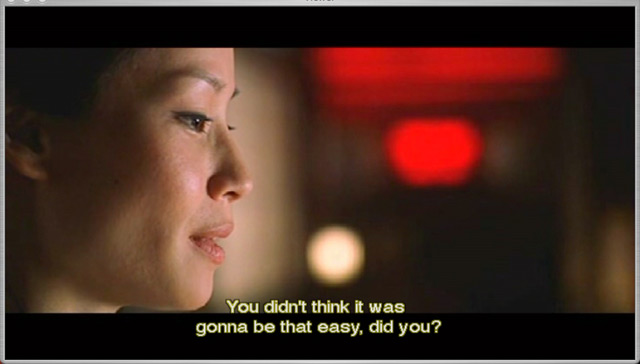
The strange part is the different placing of the sub between the computer and set-top players. Below is a capture from the DVD Player in X.3.5 with an ATI 9000 Pro card;
The problem was when a second sub line was present, the computer would move the first line up to be within the video. To correct that, I used a different offset for the double lined subs (PITA). That was what was causing the bottom line to be cut on the TVs.
Seems that my two different set-top players don't move the first line up like the computer does, and the large offset caused the clipping at the bottom. I used a universal offset (somewhere around 16) and now that same double lined sub displays almost centered in the bottom letterbox. Perfect. I'm glad I burnt a DVDRW

 Quote
QuoteSimilar Threads
-
Hardcode MKV subtitles and keep font etc?
By MrNathanF in forum SubtitleReplies: 3Last Post: 7th Feb 2012, 17:07 -
Font too small in Subtitles!
By Haole Dave in forum ffmpegX general discussionReplies: 8Last Post: 23rd Jan 2012, 16:20 -
subtitles font list
By v0llrath in forum ffmpegX general discussionReplies: 3Last Post: 20th Feb 2010, 10:33 -
Subtitles Font Size Trouble
By gdm1134 in forum MacReplies: 5Last Post: 11th Aug 2009, 22:57 -
Subtitles - colour and font size
By CompVid in forum Software PlayingReplies: 2Last Post: 18th May 2008, 15:18