


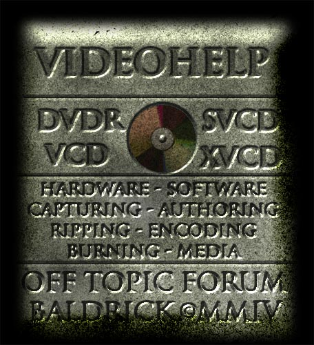
These are the iron-ons. We could probably do them all if someone wanted to, but it might be easier to get one pallet going and then do a bulk making of them. Some of these can be made into both pocket size iron-on and full, while others might not look so good as a smaller version.
Don't forget to vote for your favorite silkscreen design here:
https://www.videohelp.com/forum/viewtopic.php?p=996082#996082
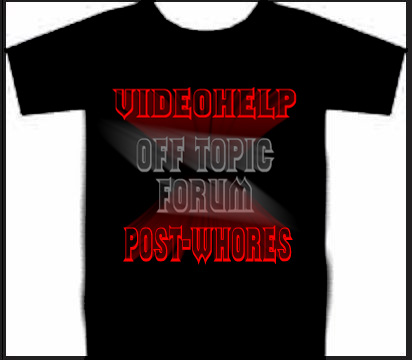
A - (Full)Front:
(Full)Back:
B - (Full)
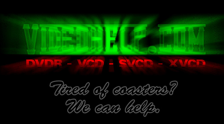
C - (Full)
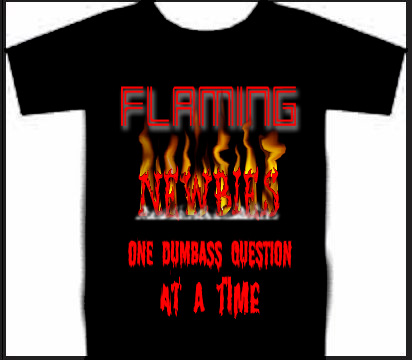
D - (Full)
E - (Full/Pocket)
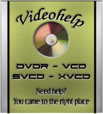
F - (Full/Pocket)
G - (Full)
[/quote]
H - (Full/Pocket)
I - (Full/Pocket)

+ Reply to Thread
Results 1 to 22 of 22
-

-
Definately A! 8)
-
A then E....
E is simple and I would actually go outside in it
-
D
Then A
D is respectable
A - When I just want to be an ass -
Master of Time & Space

- Feb 2004
- Denver, CO United States


-
What needs to be done to make this a sticky?
-
Master of Time & Space
- Feb 2004
- Denver, CO United States
-
Get a few of us to touch ourselvesOriginally Posted by Doramius
I know, uncalled for
Hey mods - how about making this a sticky? -
You are now sticky, I will unstick it when the polls finished.
-
No problem. Thanks.
-
Hello Ladies

- Jul 2003
- Studio 54
-
E, pocket style.
Wouldn't wear any of the others outside the garage.
Plus it would look good on a black T-shirt or Polo -
my "dvdhelp.us is ******* shit" should be up there

W.tgpo, my real dad, told me to make a maximum of 5,806 posts on vcdhelp.com in one lifetime. So I have. -
I thought about it heavily, and most of us wanted to wear them in public and spread dvdhelp.us site name very little. The 2 choices just kindda knocked it down. That doesn't mean we can run an iron-on later down the road. From the sounds of it, Were going to run the first iron-on based on the popularity and then run others of different designs depending on cost and popularity. Nothing against your idea, mostly because I agree 100% with you, but have you read this thread?:Originally Posted by Will Hay
https://www.videohelp.com/forum/viewtopic.php?t=232178 -
I tried to vote for 'A' 762 times, but it wouldn't let me.
'D' would be my other choice. And yes, I'd wear either one in public.
-
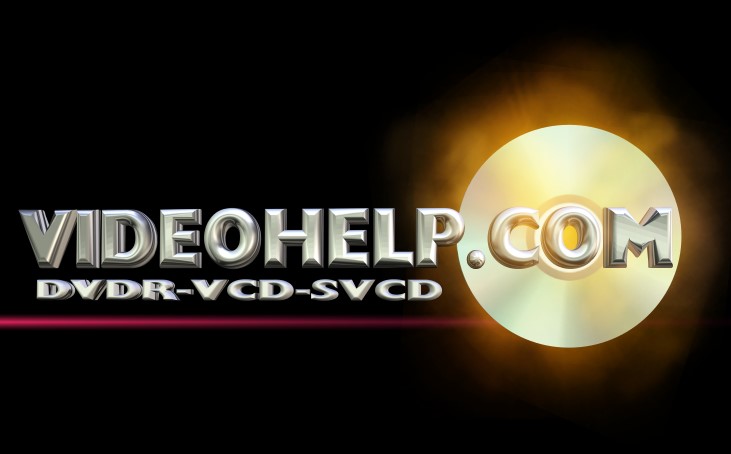
A
I can imagine the comic book guy wearing this shirt on the Simpsons. But only until the 9th or possibly 10th season which is when the show started to suck worse than anything else in the world. -
H without the VCD SVCD AND DVDR.
Or A just the front in a smaller font.... -
I was looking at costs and it'd be really cheap to do the pocket size ones. The larger one's we'd probably have to find someone to make for us, but they still aren't very expensive. I also checked out embroidered and Patches. Those are the most expensive. However, the emroidered one's would look hot with H, F, E & B on the pocket. They may be about $10-15 more expensive than the silkscreen shirts, but they are the heavy duty polo or golf shirts with the collar and three buttons.
There's also a waiting period to have those done. -
Hello,
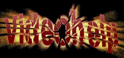
I voted E because it's simple but elegant. It gives the website name and its legible. I like the one with the green videohelp but it's TOO flashy, you really can't read the website name.
KevinDonatello - The Shredder? Michelangelo - Maybe all that hardware is for making coleslaw? -
I, no contest. Very clear, simple and video related context in the text.
-
aye aye cap'n craig. let the voting show an extra vote for I, and one less for E.
-
I also go for I
-
I, E & A all had the most votes, but there was some discussion about I being thrown in a bit late. Now again, these are Iron-ons, an can be made fairly easy. I'm going to throw a poll and thread for just these 3. and we'll see what we come up with. These original 2 threads can be removed from their sticky status if needs be. Thanks for all your help mods.
-
Member

- Mar 2003
- Chit, IDK I'm following you
-
Since I made a few of these, I think I should interject some of my thought when I made them.
A - is a shirt I would wear, I made it as a joke really and was the last one I made but it seems rather popular
B - was inteneded to be back and front. Those are actually 2 different images. The "Tired of Coasters" was intended to be on the front and then the blurry Alien style text was meant for the back.
C - was intended to be more of site label or site logo, not a T-shirt decal.
D - Intended to go on the back of a shirt, but it needs a front.
E - is not my creation but I like it quite a bit. Colorful and simple.
F - I was just screwing around, kind of like "C".
H - was intended to be embroidered on the left chest of a polo shirt. Not to be a huge picture on the middle of the chest or back of a shirt. But would be OK on the back I guess.
I - not my creation either and I applaud the creator's work, it looks nice but not something I would wear.
"H" is my favorite, but not plastered across a T-shirt. Embroidered on a black polo.
T-shirt wise I like either A or B (back/front) or D (on back) with E (on front).

 Quote
Quote