


Howdy guys. Tell me what you think about my new website design. Let me know good/bad/ugly things you see with it.
http://homepage.mac.com/tgpo/hidden/web.html
+ Reply to Thread
Results 1 to 30 of 30
-
-
Personally, for general text on my web pages, I've preferred san serif fonts. I just think its easier to read.
Nice layout though -
Ok, where to start.....Don't get mad, you asked for the advice.
On the home page, it Lists May 24th 10 times with the same info. Tomorrow is spelled incorrectly in all of them.
All other pages cannot be found from the main page (Tutorials, Movies, Contact....).
Other than that, the design is easy on the eyes... -
Master of Time & Space

- Feb 2004
- Denver, CO United States


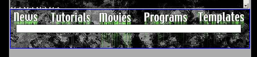
Nice start. I like the tool bar at the top. Very professional. Ditch the Mac stuff though


-
Originally Posted by Capmaster
-
Very briefly young-un, I preferd the previous (the one with the flame-ey background type thing).
I loved that site, thought it was very professional looking.
This looks less so
Sorry it's not very constructive, in a bit of a rush
Willtgpo, my real dad, told me to make a maximum of 5,806 posts on vcdhelp.com in one lifetime. So I have. -
There is no content there right now, and the same news things is there just to show what happens when the news list gets long.Originally Posted by tekkieman
I'm only looking for comments on the design right now. -
Apologies. Just reporting what I saw. Unfortunately, I would have to agree with Will Hay....to a point. While I actually prefered the old design, I do believe this one looks more "professional" (read "boring"). Seriously, if the intent is for a professional site, understatement is the prefered design. I think you have captured that well.

-
Will,
You mean the one with the blue logo up top and the navigation menu on the left side? -
Now I'm stuck.
The drop down menus from the top work well, but once they float over the iframe the cursor no longer changes to the pointer. You can still click on the links, but it also keeps me form being about to set a hover color over them. Anyone have any ideas of how to fix this. The drop down menu already has a high z-index. -
Video Restorer

- Jun 2003
- dFAQ.us/lordsmurf
-
Ditch that internal frame stuff.
 Scrolls bars everywhere.
  Want my help? Ask here! (not via PM!)
FAQs: Best Blank Discs • Best TBCs • Best VCRs for capture • Restore VHS -
really? I only see 1 in Safari. How many do you see?
-
I see 2 on IE 6 and some older versions of ie 5.x the iframe is over top of everything else - real browsers work ok, but people with older browsers might not see your menu's
-
I agree..otherwise looks good!Ditch that internal frame stuff. Scrolls bars everywhere.
-
Yeah, it was very good, I tried and tried to copy it but had no idea what I was doing so gave upOriginally Posted by tgpo
You pointed me to the site you got a brief template from, I remember you saying you customised it.
It had a oblongated (?) square with tgpo in it and flames as a background behind the text.
Willtgpo, my real dad, told me to make a maximum of 5,806 posts on vcdhelp.com in one lifetime. So I have. -
I've done some changes to the site. Made it more to my liking. Tell me what you think.
http://homepage.mac.com/tgpo/hidden/ -
AnonymousGuest
I like the new look, but I don't think it goes with the old. On one hand u have something kinda dark/mysterious with the sharp,crisp metalic tech look. The second would be better for a gaming site,etc. The first goes better with your peddling of that wack ass Mac stuff. I think as a consumer I would be more apt to buy tech stuff from the tech looking site. Both layouts are good. simple with minimal rollovers and bellz and whistles. This is just my former webdesigner opinion.Good luck.
-
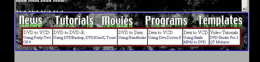
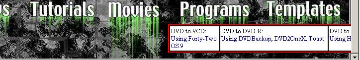
Try clicking on the tutorials link. How does the menu look?
-
the tutorials link is just "javascript:;" doesn't do anything.
-
It didn't make a menu show up underneath it?
-
the tutorials buttons opens a white box, the programs button opens a similar white box with some stuff in it.
-
Sweet, so it worked then. The only difference between the two right now is that the border for the programs should be red instead of white.
-
when i press the tutorial button
When i press the programs button
-
Weird. They should be the same.....Plus looks like I need to set no border for the bottom image.
-
How does it look now? If you open one of those menus and click on movies or news it should also close the menu. Does it do this for y'all?
-
if i hit tutorials the menu comes up, if i then hit progs a different menu comes up. if i hit tutorials again nothing happens, the progs menu stays. both menus are in the wrong place though

-
flan, what browser are you using? It makes no since why the menu would be that far over....

-
IE 6.0, screen res is 800x600 (i'm at work) i'll check it at 1024x768 when i get home.
-
it's messed up with 1024x768 as well.....

 Quote
Quote
Similar Threads
-
ISP problem - some website pages load, other website pages don't
By PartingShot in forum ComputerReplies: 15Last Post: 6th Sep 2012, 23:42 -
How many are using laptops for your design computers?
By Denvers Dawgs in forum ComputerReplies: 2Last Post: 30th Apr 2012, 12:49 -
Website design advice (Experts)
By neworldman in forum ComputerReplies: 10Last Post: 17th Jan 2011, 09:16 -
cover design software
By butterflies in forum Authoring (DVD)Replies: 17Last Post: 26th Jan 2010, 00:56 -
Would you design your own hardware if you could?
By yoda313 in forum PollsReplies: 5Last Post: 25th Jun 2007, 20:35