


Hey There,
I'm working on changing the guides colors and was looking for some feedback. The new colors are a "bit" bright and "scream" but I think they are nicer, but I want to know what you guys think about it before I do any full and permenant change, so nobody kills me
PS: Each host will have their own colors propably
http://sefy.iwarp.com/guides/index.html
or (incase one doesn't work, try the other link)
http://www.sefy.dynu.com/guides/index.html
Looking forward to any comments you got! even if it's
+ Reply to Thread
Results 1 to 30 of 43
-
Email me for faster replies!
Best Regards,
Sefy Levy,
Certified Computer Technician. -
Hi Sefy,
Hopefully my feedback will be taken as constructive and designed to help you improve the colours rather than just plain critical.
The (dark) blue, red and yellow are very close to (if not actually) perfect prime colours and, as such, naturally compete for the user's attention. With all three there it makes it "a 'bit' bright and 'scream' ", as you say.
The colours you have at present also make the site look less professional than your work deserves.
I have tried to think of alternative suggestions, but I'm not artistically minded - I have to see but can't really imagine it. Coz I'm at work, my PC doesn't have MS Paint on it otherwise I would've tried a few combinations out.
I can't think of specific colours, but keep coming back to "washed out" versions of the colours you've chosen (i.e. like pastel equivalents). The same concept as the new colours Baldrick has gone for (the side panels in the "Classic" and "Videohelp" options), but colours of your choosing.
As part of my job (I'm a software tester) I've tested a few websites and can offer a few tips on colour choices:
1. Prime colours (red, blue & yellow) demand and attract the user's subconcsious attention.
-ves: A combination can cause visual confusion as the eye is being drawn in different directions.
+ves: Good for helping key messages to stand out from the page (for text, not backgrounds).
2. White on black is considered too stark a contrast. Yellow, either prime or pastel (my preference) on black is better.
3. Where there's a change in colour (as in the top of your page going from blue to red) try to choose colours that seem to naturally flow - like blue to green, or red to mauve / purple. That reduces the shock factor of the border between them.
These links might help (I found them by typing "colour chart" into the images tab of Google):
In this one, choose colours that are next to or near each other.
In this one, colours that are opposite clash and are less user-friendly.
Whatever the colours end up being, I applaud you for at least asking - a rare occurrence.
Hope that helps. Good luck.There is some corner of a foreign field that is forever England: Telstra Stadium, Sydney, 22/11/2003.
Carpe diem.
If you're not living on the edge, you're taking up too much room. -
Hi daamon,
Thank you very much! that is defenetly constructive and helpful, I will do my best to alter the colors. Lets say I for now, just change the menubar colors, would that somewhat improve the overhaul look and be less distracting ? i'm not a designer or anything, so your help is very much appriciated!
I've changed the Menu from Yellow on Red which basicly screams, to White on Black, but when hovering over the text it's Yellow on Red, so it does grab the attention to the location the user is on the menu. Do you think it is more eye appealing now ?Email me for faster replies!
Best Regards,
Sefy Levy,
Certified Computer Technician. -
Hi Sefy,
Yes, I find it a lot less aggressive and easier to read. Try yellow on black to see what you think, but I think you might get away with white on black as it's not the entire page.Lets say I for now, just change the menubar colors, would that somewhat improve the overhaul look and be less distracting?
The yellow on red is OK too as, again, it's not a large area - I especially like the way only the option the cursor is over goes red on yellow as opposed to the whole drop down menu.
Glad to be of help...There is some corner of a foreign field that is forever England: Telstra Stadium, Sydney, 22/11/2003.
Carpe diem.
If you're not living on the edge, you're taking up too much room. -
Thanks daamon!
I Appriciate the feedback and all the comments, i'll keep it using these new alterations and see what more people think before there will be any "public" release to hosts
Email me for faster replies!
Best Regards,
Sefy Levy,
Certified Computer Technician. -
going on from daamons' comments, i'd do it a little more like this
It's a little rough but you get the idea.
-
that jpeg is BAD!
uploaded a better one here
http://www.geocities.com/flaninacupboard/sefy.htm -
Mmm... I don't know... those colours you picked seem a bit "dead" colors to me

I'm more of a "live" and "vibrant" kinda person, i've got enough dead people around this country
Haven't you noticed my Logo is a Superman Emblem ?
All the new Colors in the Guide are basicly Superman Prime Colors
But I do appriciate the feedback, nothing is permenant
Email me for faster replies!
Best Regards,
Sefy Levy,
Certified Computer Technician. -
No problem. A pleasure.Originally Posted by Sefy
LOL - Good to see you're not letting it get you down.Originally Posted by Sefy
Sefy - I think what flaninacupboard is getting at is the softer colours, not neccessarily those actual ones.
Check out this site (Norwich Union is a big UK company) to see how they go from a strong "live" and "vibrant" yellow, graduating through a softer yellow, to pale yellow to white. It also leads the eys to where the info is.
Although they use blue text on a yellow background, the text isn't competing with the background because the background is so big so making the blue stand out.
Contrasting colours work well when one of the colours is not just behind the text (like in your menu bar), but is the background for a much larger area. The eyes see this and relegate it's importance to the background and so focus on the text without trouble.
Red is best avoided as a large area background colour as it's confrontational, angry, intimidating as well as overpwering most other colours.There is some corner of a foreign field that is forever England: Telstra Stadium, Sydney, 22/11/2003.
Carpe diem.
If you're not living on the edge, you're taking up too much room. -
Oh my god! i'm blind!

What the heck were they thinking with all that bright yellow ??
Even my previous colors were friendlier then that hurrible yellow all over the place. The eyes aren't being led anywhere, they go blind and you simply shut down the page so you can restore your eyesight again
Email me for faster replies!
Best Regards,
Sefy Levy,
Certified Computer Technician. -
Sefy - Are you working on a large monitor? Being a techie and all, I bet you've got super-large split screens...
On a "normal" screen, I think it just about works - I'd say that the white area could be larger, with the bottom yellow area being smaller.
But, do you see what I mean about the graudation of strong yellow at the top down through lighter shades? I find that effect quite easy on the eye in most colours...There is some corner of a foreign field that is forever England: Telstra Stadium, Sydney, 22/11/2003.
Carpe diem.
If you're not living on the edge, you're taking up too much room. -
I don't have any split monitors, I have a 19" monitor which is 7 years old now
Most users i'll bet, have around 17" and larger these days. Anyone viewing that yellow on a full screen is gonna need a doctor for having a blind spot as if he was looking directly at the sun
I Don't buy that yellow thing, not unless you wanna blind the customer so they won't notice the prices of a product
Email me for faster replies!
Best Regards,
Sefy Levy,
Certified Computer Technician. -
You're not far off the mark! i have car insurance with these guys, cost me ~$1500 for 1 year! that was however the cheapest i could find....Originally Posted by Sefy

Daamon, i tihnk we're desensitized to that website, because we see the ads on TV so often.
I quite like the colours on here http://www.ebuyer.com/customer/home/ -
@flaninacupboard, now I see why you like the dead colours
Although I do like their fancy menus! they look nice! pity i'm not a programmer huh ?
Email me for faster replies!
Best Regards,
Sefy Levy,
Certified Computer Technician. -
Sorry Sefy - Give me your address and I'll send over some websurfin' shades...
@ flaninacupbaord - I know I'm desensitised coz that was one of the projects I worked on!!! Not that they listened to all of my team's recommendations...
I agree, I like the eBuyer colours too. It's OK to look Sefy, he's not sending you to a site that has bright green as a background...
So, Sefy, back to your site - I think it's at a stage where it's acceptable (to you as well as Joe Public) and a good basis to work from. You've got feedback and a site of "how not to do it" (though I do like the graduating effect at the top), as well as something less "dazzling" in the eBuyer site.
Feel free to PM me or post here if you want any more feedback on any other changes.There is some corner of a foreign field that is forever England: Telstra Stadium, Sydney, 22/11/2003.
Carpe diem.
If you're not living on the edge, you're taking up too much room. -
daamon, you have any idea how much it would cost you to just ship it over here ?
I did look at the eBuyers page, it has nice colors, but i'm not a big fan of the too grayish look if you know what I mean. I like colors, vibrant, alive, not the dead ones I see on the streets
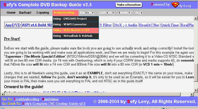
I'll keep the "new" colors for now and see what more feedback i'll get, either way, most hosts change the whole guide to suite their own page, like here for example the guide itself is altered to fit the general theme
PS: I do appriciate all the feedback and if needed, i'll do the appropriate changes, the guide is for the users after all 8)Email me for faster replies!
Best Regards,
Sefy Levy,
Certified Computer Technician. -
Oh yeah, I hadn't taken into account the protective box I'd need to put them in...Originally Posted by Sefy
Of course - the page has to have a part of you in it too...Originally Posted by SefyThere is some corner of a foreign field that is forever England: Telstra Stadium, Sydney, 22/11/2003.
Carpe diem.
If you're not living on the edge, you're taking up too much room. -
Looks like i've setteled on the colors
Now I just work on updating the guide, which is killing me as it is
Email me for faster replies!
Best Regards,
Sefy Levy,
Certified Computer Technician. -
Hi Sefy,
Yeah, they work. Glad I played a part in helping.
Good luck with the updating...There is some corner of a foreign field that is forever England: Telstra Stadium, Sydney, 22/11/2003.
Carpe diem.
If you're not living on the edge, you're taking up too much room. -
Hi Daamon,
You played a big part and I do appriciate it! I just wish others would also give their input, but i've given up, to be honest, I don't know why I still work on the guide, I get no feedback from anyone Email me for faster replies!
Best Regards,
Sefy Levy,
Certified Computer Technician. -
i appreciate your guides! where would i send irritating newbies if we didn't have guides for everything!?
In all seriousness, it was your guide i used when i started out with VCD. after i'd got a handle on the situation i taught myself DVD, but you enabled me to do my first VCD backup. well done, it's you the MPAA should be hunting down!
-
Why would they hunt me down ? I don't do ripping guides, I do backups
You should see the new guide, it's upto 60 programs now! i've included just about any DVD to DVD backup tool I could find and understand
Email me for faster replies!
Best Regards,
Sefy Levy,
Certified Computer Technician. -
Sefy
I think one of the reasons the response back to you is so low is that your guides are so professionally created that once we make the first visit and print out your guides the end result is so good, the only thing left is to come back from time to time to review your updates. I know when I first started with the VCD creation over three years ago (first joined 17 Mar 2001) your guide was the first one to get me through the process without a lot of “Tech” talk, the old saying of “A Picture is Worth a Thousand Words” holds true with your guides. I may not make a lot of post but I do read the forums on a daily bases and review the areas I have interest in and when I see a response you have posted to a question I know I can use that advice. So to put your mind at ease, I am extremely grateful for all your hard work and expert advice on the process
Bud -
See, now those are the kind of words that keep a guy smiling and knowing that his work is appriciated
I know this may sound egoistic of me, but i've added a new page (actually a whole website of 12mb) that is dedicated to users writing comments and/or suggestions for improvements on the guide.
http://guides.iwarp.com/write.html
1: it will be fun to read your comments/suggestions
2: will let me know that people still appriciate the guide (you do not even want to begin knowing how hard it is to maintain 60 programs!)
3: I'll be able to improve better and add what people want quicker instead of trying to figure out on my own
4: will give me a little ego boost
Email me for faster replies!
Best Regards,
Sefy Levy,
Certified Computer Technician. -
I know - it's quite demoralising. I mean, I'm not in your league but when I know I've helped someone out it's sad to see them not come back with a "Thanks, that helped". Even if it's just to confirm the advice was sound so that others can then know to use it. I'd call it "forum etiquette"...Originally Posted by Sefy
I'm sure Bud and flaninacupboard are representative of a much larger group of people who you've helped and who appreciate it. Ever since I've been using these forums I've noticed that you are in a group of people who's advice is always well constructed and well received. I know that I've certainly read your responses in posts and have been helped by them.
Don't do yourself down - but it is mostly a thankless task keeping such a guide current. Maybe you should ask Baldrick to put a hit counter on the main page(s)?
So, please don't give up on those who don't have the time or manners to say thank you coz there are a whole load of people who do appreciate you.There is some corner of a foreign field that is forever England: Telstra Stadium, Sydney, 22/11/2003.
Carpe diem.
If you're not living on the edge, you're taking up too much room. -
I know there are lots of people who appriciate the guide, and i'm doing all the best I can to make it the best guide out there for newbies. But it's getting bit frustrating. Like one the big post I have on the guide and I put updates, i've not seen anyone commenting.
I Don't know if what I do is what people want, it's like a "nonchalant" (I think that's the word) situation. Where it's ok if I do and ok if I don't. I'm thinking that after I finish with v2.6 of the guide, i'm gonna take a break from it.
I'm currently just waiting for my friend from Canopus to send me ProCoder, and once I include that in the guide, i'll officialy have over 60 programs in it, the guide will reach 7mb size (zipped) and it may sound egoistic, but I think it is by far the largest guide on the net which covers near every program.
I don't get any help on it, so I end up doing everything myself and learning all the programs which I don't even use () just so it will help others, but I have no idea if it's even that, cause no one tells me anything, I think that one day Baldrick will kill me for all the updates
Anyway, I believe that by Sunday i'll finish everything and put the guide on a hold. I've spend this entire week optimizing, fixing, editing, uploading and testing it, and by god I need a vacation!
Email me for faster replies!
Best Regards,
Sefy Levy,
Certified Computer Technician. -
Hi Sefy,
Maybe that's the answer: Get the guide to a state where it's comprehensive and informative over a lot of tools and leave it (sounds like that'll be this weekend). People tend to miss things when they don't have them...
So, as long as the guide refers to the versions of each software, you can judge the demand by the number of requests you get to update certain areas as new versions come out - that way you'll know where to put your effort and you know that people are using it.
This, of course, assumes that you'll put something on there telling people they can contact you requesting updates to the guide.
And, if you feel like doing extra then that's your choice...
P.S. Enjoy your break - even if it is only from "the guide"...!!!
There is some corner of a foreign field that is forever England: Telstra Stadium, Sydney, 22/11/2003.
Carpe diem.
If you're not living on the edge, you're taking up too much room. -
Video Restorer

- Jun 2003
- dFAQ.us/lordsmurf


Sefy, my eyeballs hurt now. Really, not just saying that. They hurt now. Suggest calmer colors for blue. Red and black are fine. Though a maroon is easier on the eyes, and has same effect as red in this case. What Baldrick has done here on VideoHelp is very classy, very pro.
Want my help? Ask here! (not via PM!)
FAQs: Best Blank Discs • Best TBCs • Best VCRs for capture • Restore VHS -
@daamon, yup, I think that's what i'll do, as for allowing people to contact me that is why I put the new "Comments" page, question is if anyone is gonna be using it
@lordsmurf, so you suggest I put a darker version of blue to make it easier on the eyes ? see, why didn't you tell me at first huh ? :PEmail me for faster replies!
Best Regards,
Sefy Levy,
Certified Computer Technician. -
See, now you're on to a win-win situation - If they do use the "Comments" page then you're only updating the stuff that needs it, and if people don't contact you then you know the guide's sufficient as it is and you can update it when you feel you need to...Originally Posted by SefyThere is some corner of a foreign field that is forever England: Telstra Stadium, Sydney, 22/11/2003.
Carpe diem.
If you're not living on the edge, you're taking up too much room.
 Quote
Quote
Similar Threads
-
How to edit these colors?
By ashkan_vpm2 in forum SubtitleReplies: 0Last Post: 15th Jul 2010, 06:29 -
Weird subtitle colors when authoring a DVD
By dexter30 in forum SubtitleReplies: 4Last Post: 22nd Feb 2010, 21:54 -
TV Safe Colors ?
By Mike99 in forum Authoring (DVD)Replies: 31Last Post: 13th Nov 2008, 03:01 -
TV Guide/Guide Plus+ After Feb. 2009
By handyguy in forum DVB / IPTVReplies: 0Last Post: 30th Oct 2008, 10:34 -
ripped and copied DVD colors gone
By mercjoe in forum DVD RippingReplies: 1Last Post: 16th Feb 2008, 20:00