


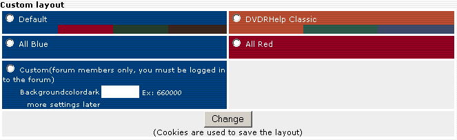
and you will be able to choose some other colors later also.
Try StreamFab Downloader and download from Netflix, Amazon, Youtube! Or Try DVDFab and copy Blu-rays! or rip iTunes movies!
+ Reply to Thread
Results 1 to 30 of 73
Thread
-
I'm a MEGA Super Moderator

- Aug 2000
- Sweden


-
I'm a MEGA Super Moderator
- Aug 2000
- Sweden
-
and if you don't like big changes so can you still use the old classic colors

-
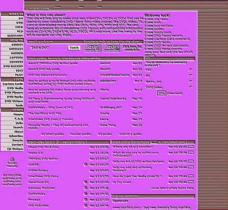
Oh man, I like that blue screen!

-
kinda mac looking 8)
"Each problem that I solved became a rule which served afterwards to solve other problems." - Rene Descartes (1596-1650) -
Hello Ladies

- Jul 2003
- Studio 54
-
why not a drop down box so we can select our own colors?
Don't they just use stylesheets or something like that?
Personally, I like the blue for the forums.
I hope you keep the different colors for the side menu, but change their colors....
Pastels are so 70s
-
I'm a MEGA Super Moderator
- Aug 2000
- Sweden
-
or darkred
and yes I can change to diffferent colors in the menu. I just want to find some good colors first. You will be able to change your own custom colors later. -
How about that blue or dark red screen, but change the color to a darker green?
-
How about active cycling through all the colors every few
seconds . Should drive the borderline mental cases
over the edge -
Video Restorer

- Jun 2003
- dFAQ.us/lordsmurf
-
I like the blue one.

Red is very nice too. How about green too? And maybe brown?
Those are regarded as "business" colors and looks great.
Good call on making the menu bar shorter. The one here now IS a bit too long and cluttered with descriptions.Want my help? Ask here! (not via PM!)
FAQs: Best Blank Discs • Best TBCs • Best VCRs for capture • Restore VHS -
how about something simple like this:
 "Each problem that I solved became a rule which served afterwards to solve other problems." - Rene Descartes (1596-1650)
 -
I'm a MEGA Super Moderator
- Aug 2000
- Sweden
-
a green, red, brown, blue menu
-
Hay Baldrick..
The blue one in your first post was great.
Personally, I prefer to stick to the old tried and true, but sometimes change
is good too :P ..and if you must..
.
.
It's your site, so have some fun tweaking it.. ( hopefully in our favor :P )
But, please do make it USER configurable, so we can change to ANY color
scheme we choose - please ?
But, the blue one, I would be willing to change to - - for sure hehe.. :P
TGIF everyone,
-vhelp 2488 -
That Blue is great . A lot easier on the eyes.
-
Video Restorer
- Jun 2003
- dFAQ.us/lordsmurf
-
This is where you can start in with sub templates. Your site is large enough to do it. Small sites cannot effectively use sub templates
You take the core colors: red, blue, green, brown...
And then each "section" as you marked off on the menu is also the color of every page in that section.
.. WHAT IS, LIST, HOW TO, and OTHERS each has it's own menu color...
... AS WELL AS the pages that are linked OUT OF that menu.
So all the VCD/SVCD/etc pages linked out of WHAT IS will have that unique GREEN color for the pages. The LIST pages will all have that BROWN color on those pages.... etc...
Good choice on BLUE "OTHER" section, I'd much prefer a BLUE forum. It's by far one of the easiest colors on the eyes, especially in combination with gray and white like you have. Considering the major (I'm asumming major) pull to the site is the forum, best to keep the best color options here (without making whole site blue ... several tasteful colors gives it a designers edge).
This is, of course, some fairly advanced template action, but the results are always quite nice. I've done this sort of makeover for sites several times. The results are always pleasant.
You're giving the site a nice facelift from what I've seen so far. Lot of nice new features too. It's not often I'm impressed by both content AND design, but you've peaked my interests.
EDIT: Ah ... shows how much I read other pages .... you've already got sub templates color schemes going, huh? Want my help? Ask here! (not via PM!)
FAQs: Best Blank Discs • Best TBCs • Best VCRs for capture • Restore VHS -
The blue looks great.
-
I'm a MEGA Super Moderator
- Aug 2000
- Sweden
-
I have had subcolors since 1999...Originally Posted by lordsmurf -
Hi Baldrick,
My offering: I like the blue in your first post, and the colours for the side panel in your post "17 Apr, 2004 00:35".
User-selectable colours would be even better...There is some corner of a foreign field that is forever England: Telstra Stadium, Sydney, 22/11/2003.
Carpe diem.
If you're not living on the edge, you're taking up too much room. -
The blue looks good to me but a mix similar
to your example of "green, red, brown, blue menu" but
with a blue base, would suit more people in navigating your site. -
I like it as is, it's distinctive - i see a lot of forums that are white and blue, but red and grey is good. if anyone sees me at a PC with red and grey they know what i am doing and leave me alone!
-
I am borderline. I hate change. If you change now I will not know where I am.Should drive the borderline mental cases
Please dont tip me over the edge... -
I'm a MEGA Super Moderator
- Aug 2000
- Sweden
-
The entire site is now updated and I'm using the new design...I will soon also let you test it before I make it to the default.
-
I'm a MEGA Super Moderator
- Aug 2000
- Sweden
-
-
Hello Ladies
- Jul 2003
- Studio 54
-
where might this be located?
-
How about a black backround with neon(especially green and pink) writing. It would look so techno and cool
-
I'm a MEGA Super Moderator
- Aug 2000
- Sweden
-
-
I Actually like the colors you picked! but then again, I like plain things which are easier on the eye. But I think for the categories on the side, it would be best to make it more colorful for each section.
Email me for faster replies!
Best Regards,
Sefy Levy,
Certified Computer Technician. -
I like the blue 2
-
Video Restorer
- Jun 2003
- dFAQ.us/lordsmurf
-
When's it gonna happen? I can't wait for the new look.
Want my help? Ask here! (not via PM!)
FAQs: Best Blank Discs • Best TBCs • Best VCRs for capture • Restore VHS -
Looks Great! Can't wait

 Quote
Quote


Similar Threads
-
Problem with colors
By JJon in forum Video ConversionReplies: 4Last Post: 16th Feb 2012, 06:42 -
Youtube changed my colors! What to do?
By thurnau in forum Video Streaming DownloadingReplies: 53Last Post: 8th Feb 2011, 13:18 -
How to edit these colors?
By ashkan_vpm2 in forum SubtitleReplies: 0Last Post: 15th Jul 2010, 06:29 -
Colors too saturated after x264
By crooper in forum Newbie / General discussionsReplies: 5Last Post: 12th Mar 2010, 17:09 -
TV Safe Colors ?
By Mike99 in forum Authoring (DVD)Replies: 31Last Post: 13th Nov 2008, 03:01